ALIEN, RIPLEY, KANE, & PARKER
ALIEN MINIMATES

You know how I said I hadn’t reviewed enough Minimates lately? You know what else I just haven’t reviewed enough of? Alien and Aliens stuff. Just not enough of it.
So, welcome to another Alien-themed review, which, by the way, is also yet another Christmas Review. Yeah, they seem to be the song that will not end. At this rate, I kind of expect to sporadically be reviewing last year’s Christmas gifts until this Christmas. Won’t that be fun?
When Diamond Select Toys picked up the Aliens license, there was some confusion as to whether this meant we’d also be seeing Minimates of the characters from the first movie. As it turned out, yes, though as more of their own thing, and less as a subset. So, without further ado, Alien Minimates.
THE FIGURES THEMSELVES
These four were released as part of a boxed set celebrating the 35th anniversary of Alien. They were supposed to be out last year, you know, for the actual anniversary, but they encountered a few delays, making them a mid-January 2015 release.
ALIEN
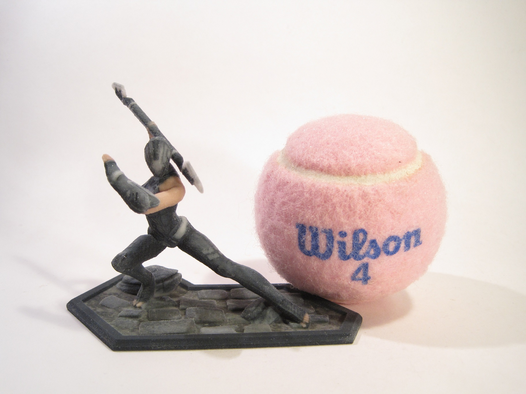
 It would be ridiculous to release a set without the titular creature, so here it is! It’s referred to simply as “Alien” on the package, but this is the design most commonly known as the Big Chap, the creature from the first movie. The figure is a little over 2 ½ inches tall and it features 16 points of articulation. The figure is built on the standard Minimate body, with a non-standard head, hands, and feet, as well as an add-on for the torso and tail. From the neck down, all of the pieces are identical to those of the three Alien Warriors included in the Aliens Minimates Army Dump set. Since the Alien designs in the two movies are similar, this is a pretty sensible re-use, and the pieces are still fantastically sculpted. My only real complaint is that the hands technically should have six fingers, instead of the three fingered Aliens design, but at this scale and style that’s minor. The head is the one new piece, and it’s very well done. It features the first movie’s signature head dome, as well as the skull detailing underneath, and it looks really good. It’s also a bit bigger than the Aliens head, which looks a bit better in retrospect. The paint is also identical to the normal Aliens Warrior from the neck down, with the exception of the upper arms, which have a slight change in detailing. There’s also some detailing under the dome, outlining the skull. All of the paintwork is clean and sharp, and the detailing is really great. The Alien’s only accessory is a clear display stand.
RIPLEY
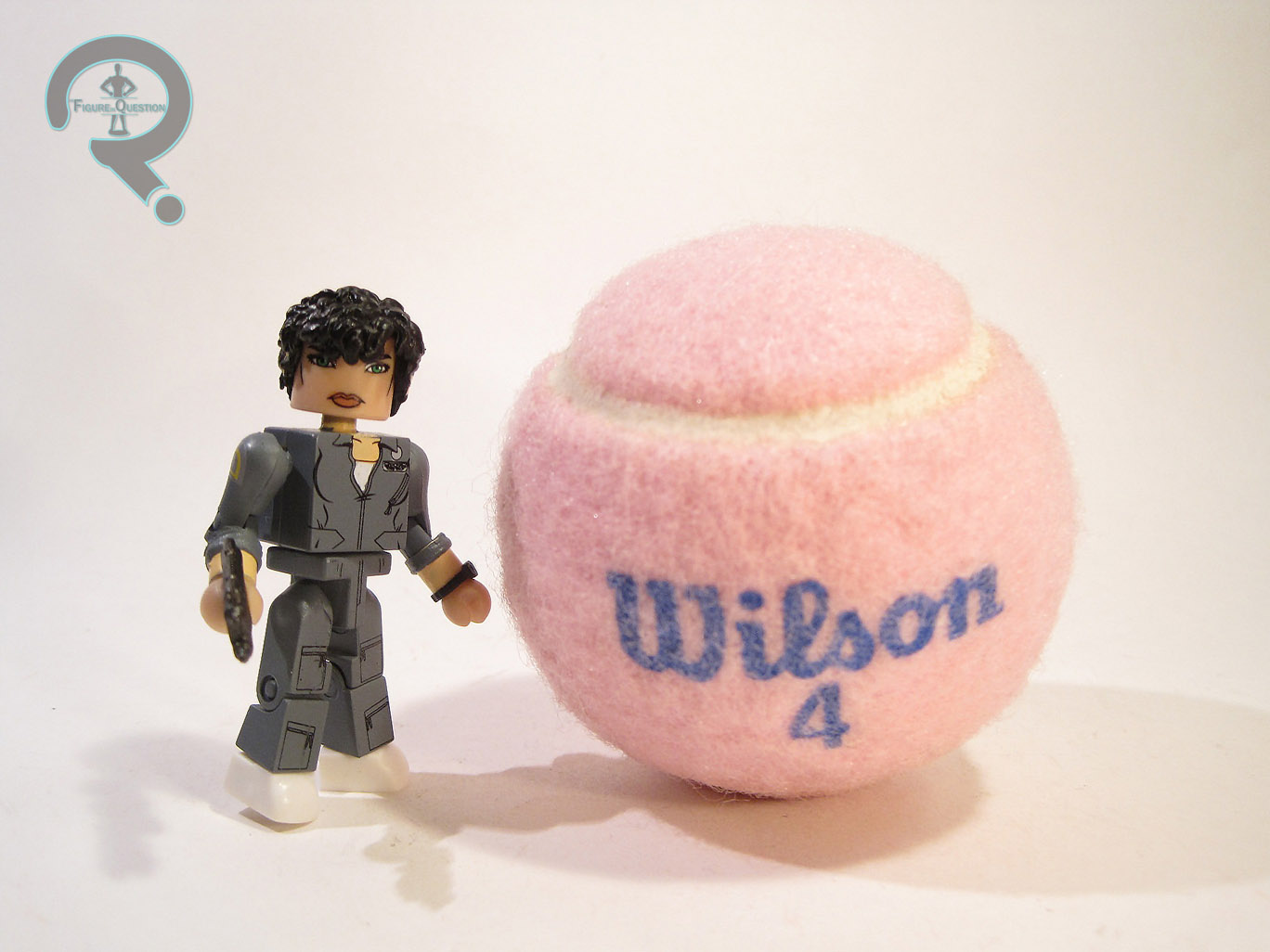
 Much as you can’t do the set without the titular character, it would also be odd to get an Alien set that didn’t feature Warrant Officer Ellen Ripley, the sole survivor of the original film and the true star of the film series. Ripley is 2 ½ inches in height and features 14 points of articulation. She’s based on Ripley’s appearance from the second half of the film, while she’s running through the Nostromo avoiding the creature. She’s built on the standard Minimate body, with a sculpted hairpiece, a watch, and rolled up sleeves. The hairpiece is a re-use from For A Few Dollars More’s El Indio, which is a perfect piece for Ripley’s look… in Aliens. Sadly, it’s totally off for her look in Alien, where her hair was a fair bit longer. Looking through their back catalog of pieces, there isn’t one that’s a natural fit for Ripley in Alien, so I suppose they were just trying to make the best of what they had. It just doesn’t really work. Ripley’s paintwork is generally pretty good, aside from one issue: the likeness on the face isn’t quite there. It’s not terrible, but it doesn’t really look like Sigourney Weaver. DST did a pretty good job capturing Weaver in the Ghostbusters line, so I’m not sure what happened here. Fortunately, there are a few alternatives, so it’s not a total loss. The rest of the paint is quite well done, with lots of really great detail work, which even continues onto her back. Ripley includes a flame thrower, Jonesy the cat, and a clear display stand.
KANE
 In spite of John Hurt’s resistance to his likeness being used, Kane seems to turn up quite a bit in Alien product. Not a huge shock, seeing as his role as the carrier of the first Xeno is pretty pivotal. Kane is depicted here in his Nostromo uniform, which he wears early in the film, prior to setting down on LV-426. I actually don’t recall him being without his jacket for very long, so it’s omission is a little odd. Seeing as the figure includes a chestburster piece, I would think his “last supper” look might be more appropriate, but I suppose DST felt like being different. The figure is roughly 2 ½ inches tall and features 14 points of articulation. Kane is built on the standard body, with a sculpted hairpiece and a watch (same as the one on Ripley). As far as I can tell, the hair is new to the figure. It seems to me that Kane probably could have made do with a re-use if it meant giving Ripley a new piece that was more appropriate, but there might be more to it than that. Regardless, the piece is well sculpted and seems like a pretty good match for his look from the movie. Kane’s paintwork is very nicely done. Everything is nice and clean, and all the colors seem just right. The likeness isn’t spot on, but I’d chalk that up to Hurt’s likeness not transferring to the style. The eyes and mouth are definitely right. Kane includes a facehugger, a chestburster, an extra head, and a clear display stand. The facehugger is a little difficult to get on at first, but it’s very well sculpted and it even features the appropriate detailing on the inside. The chestburster and extra head allow for a recreation of the memorable “birth scene.” The ‘burster is well sculpted and fits pretty well in place. It also covers enough of his torso to make this look like the appropriate uniform, so kudos to DST on that!
PARKER
 Parker probably marks the set’s oddest inclusion, as he’s not a character who’s incredibly key to the plot. That said, he’s one of the last survivors, and my personal favorite character, so no complaints there. This figure has the notoriety of being the first Parker figure ever, so that’s cool. Parker is about 2 ½ inches tall and features 14 points of articulation. He’s based on Parker’s look roughly mid-movie, after he’s ditched his coat. The figure is built from the standard Minimate with a sculpted hairpiece. The piece is new to this figure and it’s a good translation of the look from the movie. Parker has a pretty decent paint job. His uniform is well detailed and everything is nice and clean. The only real issue I have is that his skin tone just seems to be too light for Yaphet Koto. This ends up throwing off the likeness, which is otherwise pretty spot-on. Parker includes a flamethrower, a flame attachment (though that could easily be paired with Ripley, too), and a clear display stand.
THE ME HALF OF THE EQUATION
This boxed set was a Christmas gift from my parents. I’m going to take a shot in the dark and say that it’s my last gift of the Christmas 2014 season. Obviously, this set, being based on the first movie, isn’t going to ignite me with the same excitement as the Aliens Minimates, but I do think they turned out pretty nicely. The real weak link of the set is definitely Ripley, who really isn’t accurate to her appearance in the first film. But hey, put a pulse rifle in her hands and you’ve got a pretty great Aliens Ripley, so it’s not a total loss!

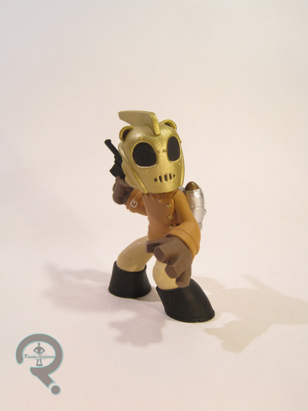
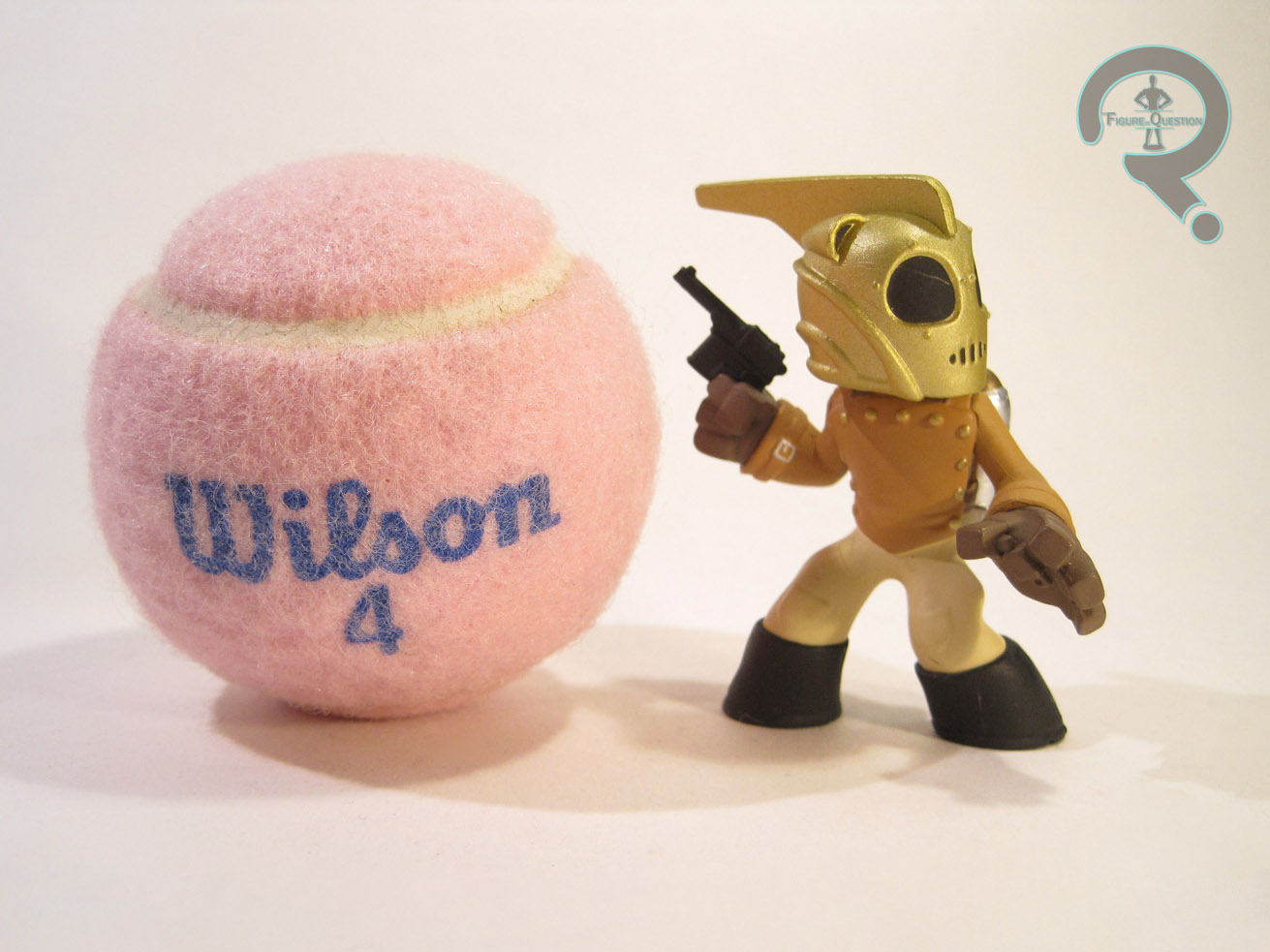 The Rocketeer was released as part of the first assortment of Science Fiction Vinyl Figures from Funko. He doesn’t quite fit in with the rest of the more iconic sci-fi characters in the assortment, but I’m hardly going to complain about that. The Rocketeer is one of the rarest figures in the series, at a ratio of 1:72. Seems like this guy’s only going to be seen by the most dedicated of Rocketeer fans. The figure is about 2 ¾ inches tall and features no articulation. He has a totally unique sculpt and it’s probably the best in the series. It’s cleanly sculpted, there’s lots of great detail work, and everything is very well defined. The character’s design has been tweaked to fit the overall style of the line, but like Robby, he hasn’t had to be changed too much. The figure is posed in the most extreme of the poses we’ve seen on the figures reviewed here. It’s the character’s signature pose, seen right before the movie’s climactic battle as he stands in front of the American flag. It’s a perfect pose for the character and it’s been translated really well. Rocketeer’s paint is pretty good; nothing fantastic, but solid work. All of the colors are on the mark and everything cleanly applied with no real slop or bleed over. The lack of any real issues is actually really good for Funko, who can sometimes have some issues with quality control on their stuff.