#0664: Silver Ranger

SILVER RANGER

POWER RANGERS IN SPACE

SilverRanger1

When I was a fair bit younger, I was pretty into Power Rangers. That shouldn’t be a shock, seeing as I was a boy under 10 in the 90s. It was sort of a rite of passage. Once I hit 10 or so, I moved away from the series, though, unlike a lot of other people, it wasn’t because I suddenly found the series lame, but rather because none of the new seasons could live up to Power Rangers In Space, which had been by far my favorite iteration of the series. I recently sat down and watched a few episodes from the show and I was actually pleasantly surprised to find out that the show was actually as good as I remembered it to be. Like just about every Power Rangers incarnation, In Space had a “Sixth Ranger” added to the team as the show progressed, called the Silver Ranger because he was…well, silver. He was super cool. Let’s look at a toy of him!

THE FIGURE ITSELF

SilverRanger2
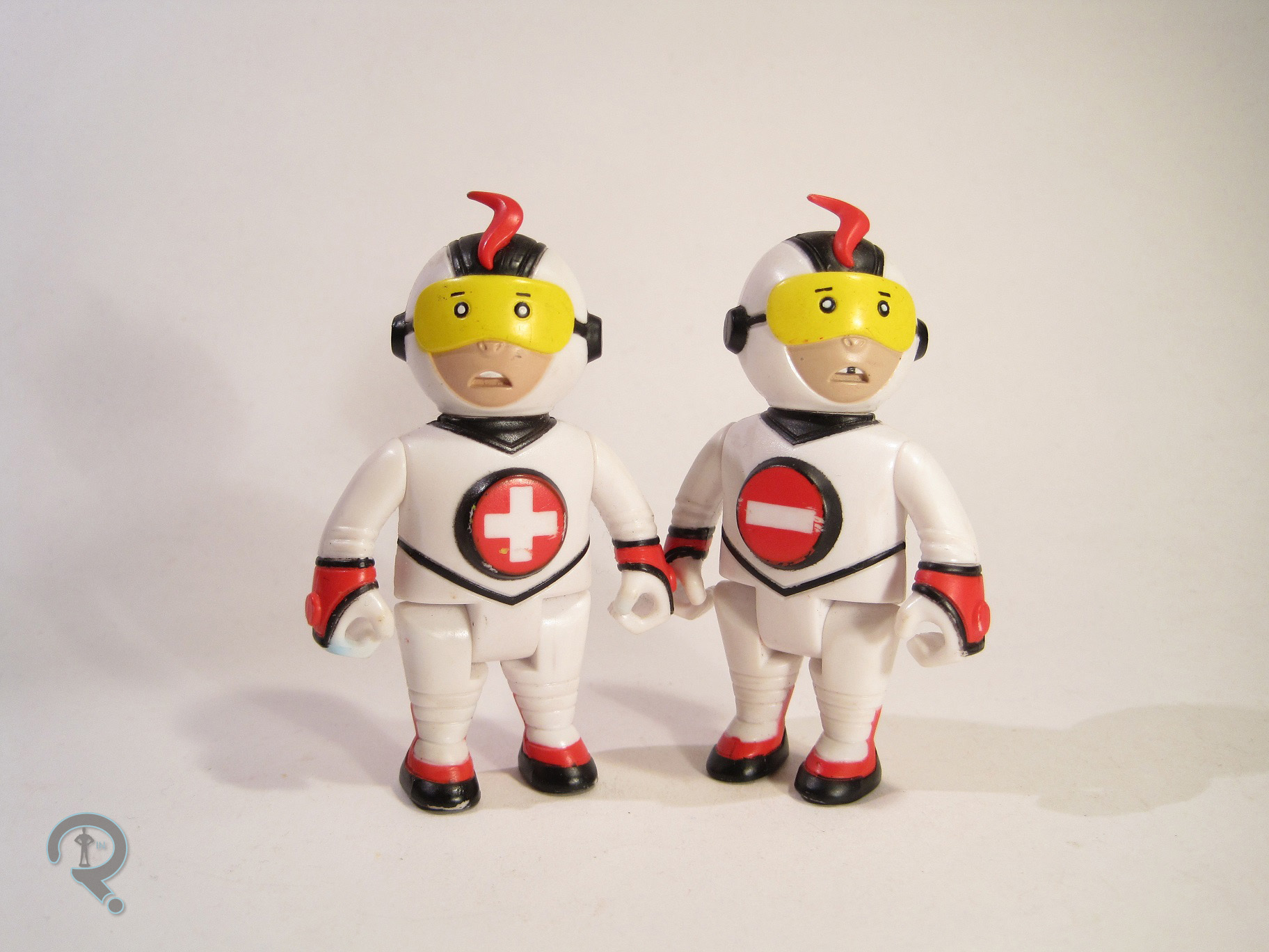
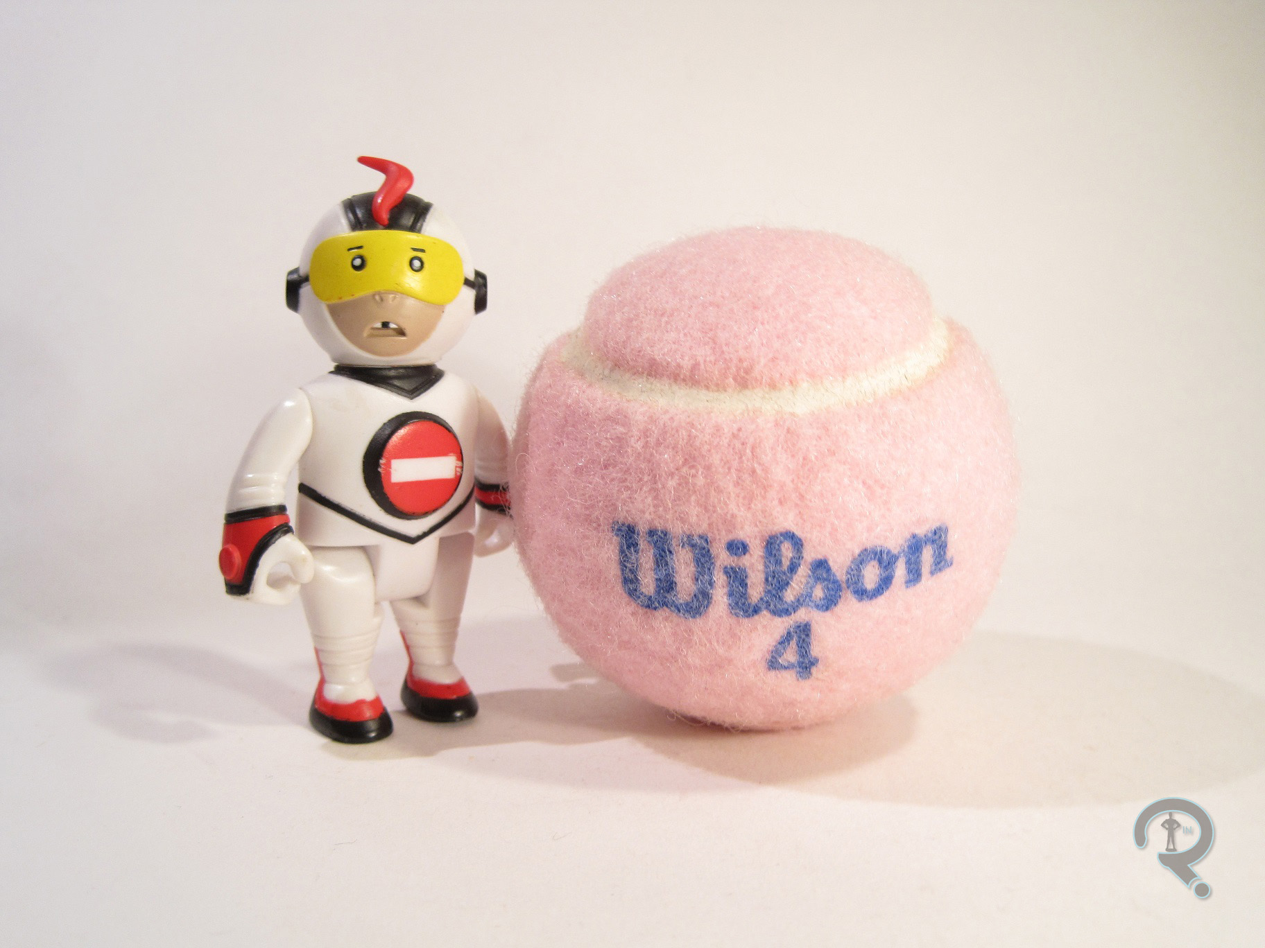
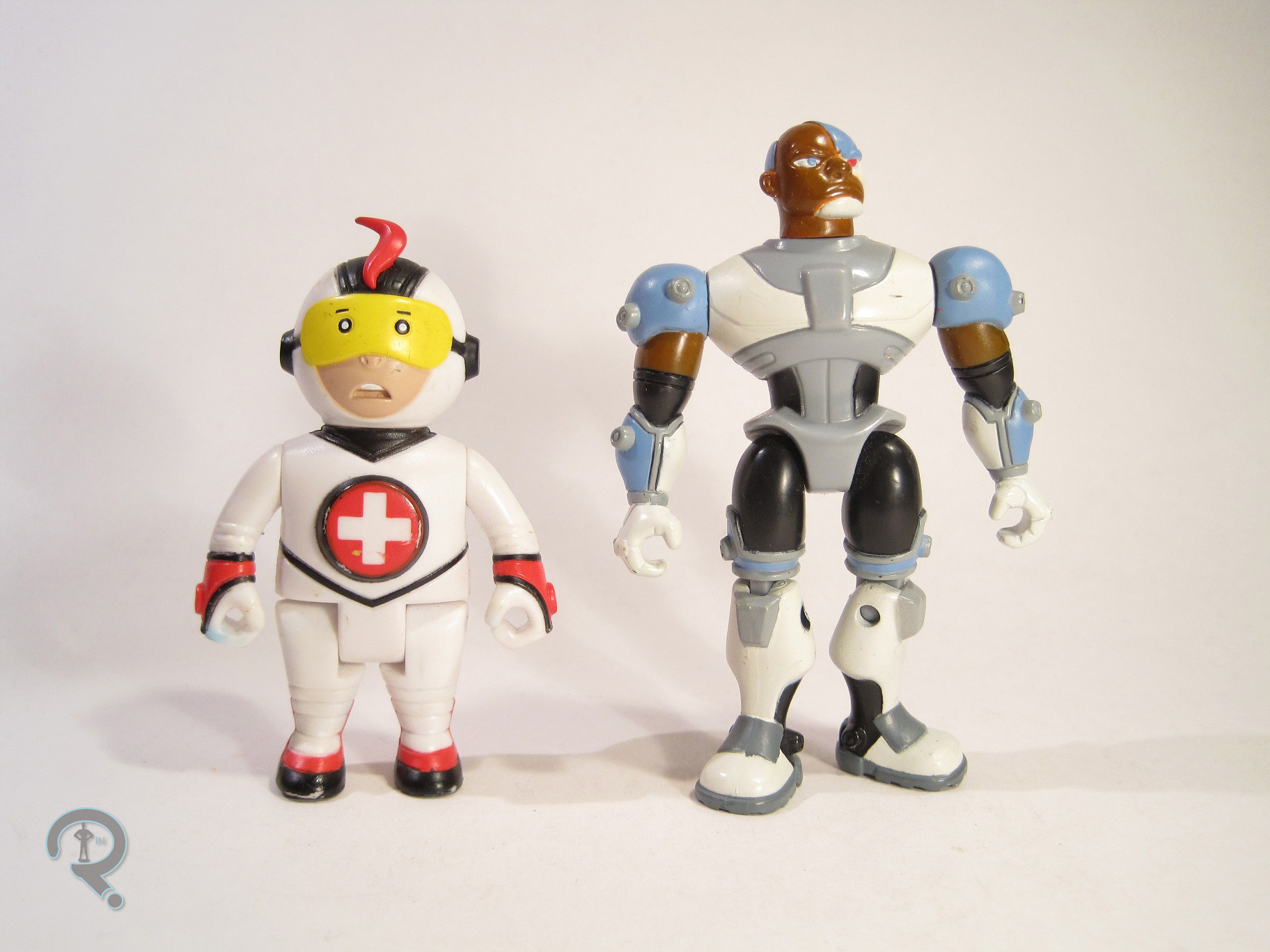
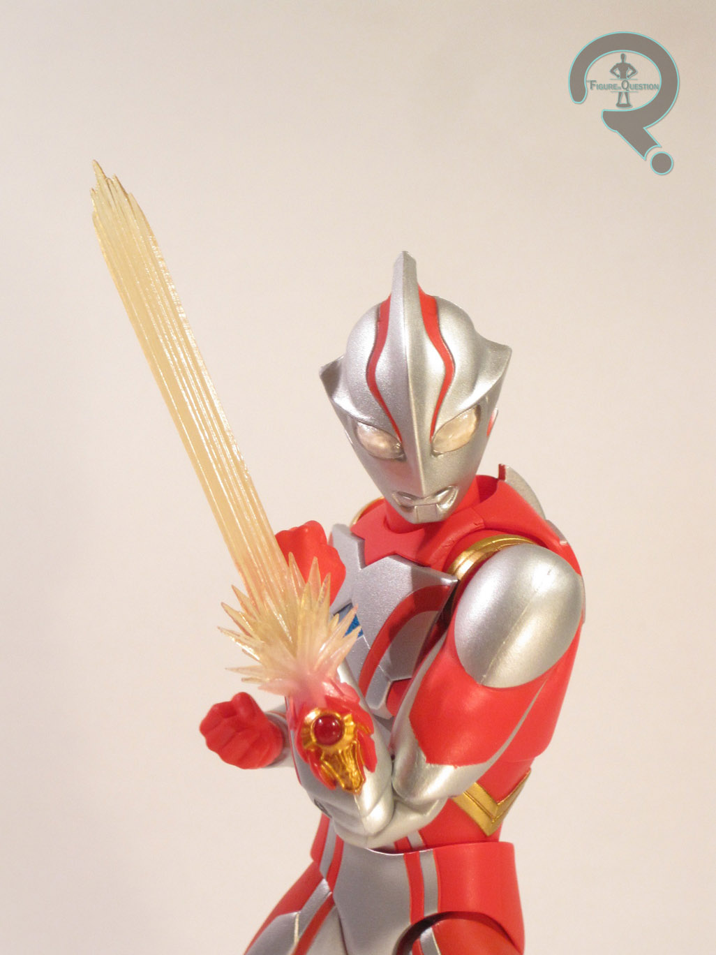
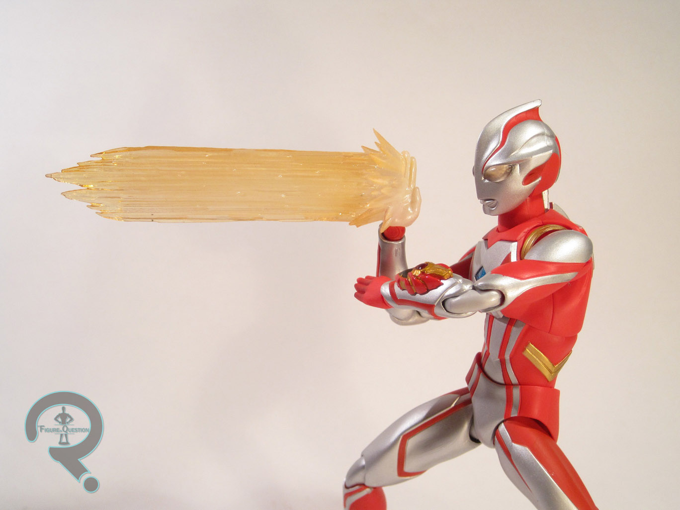
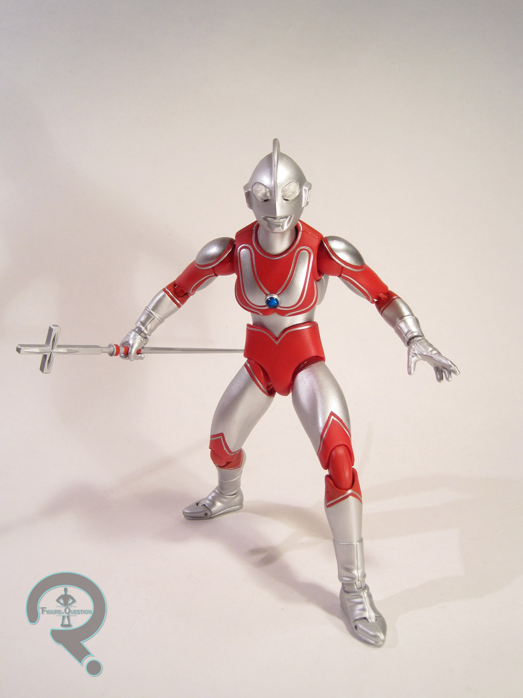
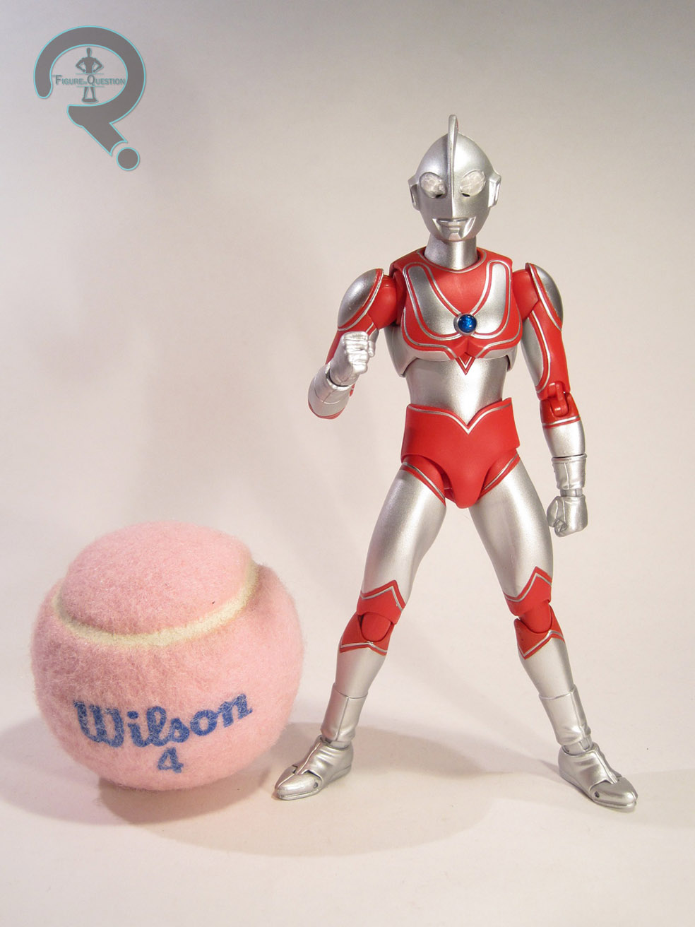
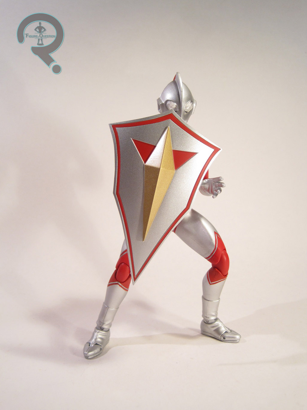
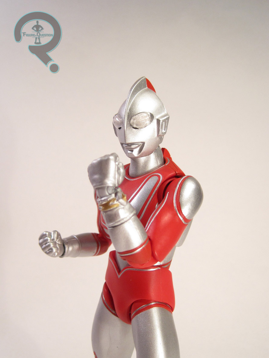
The Silver Ranger was an interesting case as far as figures go. None of his figures were in the initial offerings of toys, as his character had not yet appeared. When he did finally appear, Bandai had to do a handful of special offerings to ensure that he got a few figures that would fit with the other Rangers. This particular version was released in a set with a Galaxy Cycle in silver. The figure stands roughly 4 ½ inches tall and has 13 points of articulation. Silver is built on the exact same body used for all of the Galaxy Cycle Pack-in cycles (yes, even the girls). It’s an interesting body because, unlike all of the other Power Rangers In Space figures released in the US, the figures on this body aren’t overly musclebound. That’s actually kind of nice to see. That said, the body ends up being exceptionally simplistic in general, which doesn’t win it a lot of points. Aside from the slight detailing on the mouth of the helmet, and some decent work on the belt buckle, the figure is more or less devoid of any real detail. It looks somewhat like a crash test dummy. Also, the hands are ginormous, to almost insane levels, which looks rather silly on an otherwise skinny figure. It’s not a bad sculpt overall, but it was out of date even when it was brand new. The paintwork on the figure is just about as simple as the sculpt. He’s mostly just molded in the appropriate colors, which leads to some oddness, especially where the gloves go up past the elbows. The head gets the best detailing, with several different colors and no real issues with bleed over and slop. The details on the torso aren’t actually painted. Instead, they’re just decals, which definitely didn’t hold up in the long term. The Silver Ranger originally included a blaster, as well as the previously mentioned Galaxy Cycle. However, my figure has neither of these, so no review for them. Sorry guys!

THE ME HALF OF THE EQUATION

Silver Ranger was purchased at Yesterday’s Fun while I was on vacation this year. I never managed to find any of the basic Silver Ranger figures growing up, and they’ve since shot up in price, so I was actually pretty excited to find him. Yeah, the figure is definitely dated, and not in the greatest condition, but it’s the Silver Ranger. He’s just cool! And that kind of outweighs the negatives.

#0562: Android No. 16

ANDROID NO. 16

S.H. FIGUARTS

16a

Hey, remember when I reviewed the last two Dragon Ball Z Android figures from SH Figuarts and I was all like “I guess I have to buy the third one now?” Well, I, uhh, bought the third one. Yeah, I’m kind of a pushover when it comes to action figures. So, today, I’ll be having a look at Android 16, the third member of the main android trio, and the only one of them who was actually, you know, an android. Funny how that works.

THE FIGURE ITSELF

16bAndroid 16 is another figure from the Dragon Ball Z subset of Bandai’s SH Figuarts line. The figure was released around March or so of this year. The figure stands over 6 inches in height (almost a full inch taller than his compatriots) and features 32 points of articulation. While the other two androids were known to change up their style from time to time, 16 had exactly one outfit on the show, and this figure depicts him in said outfit. Like the last two figures, 16’s sculpt is unique to him. The figure does a fantastic job of translating the character’s design from the show into three dimensions. Sometimes figures of animated characters will only work when viewed from certain angles, but that isn’t an issue here. The sculpt is nicely proportioned and has some really sharp work, especially in areas like the folds of his boots and the texture of his shirt. Also, the work on the faces seems a lot clearer and more defined here than it was on the previous two figures, though it may just be Bandai taking advantage of the slightly larger scale of the sculpt. There are three different faces that can be swapped out. He comes packed wearing the death-glare head, which is sufficiently intimidating, but he also has heads with grinning and shouting expressions, should you want to mix things up. In addition to the basic heads, there is a battle-damaged head, which shows some of the inner workings of 16’s head, and gives him a more shocked expression. 16 includes two pairs of hands, in fists and open gesture, and his forearms can be removed to replicate his fist-launching ability, which also showcases some great detail work on the “stumps” of his forearms. 16 doesn’t feature the most complicated paintwork, but what’s there is clean, even, and avoids any issues of slop or bleed over. The colors are also a pretty good match for those used on the show. The heads all feature essentially the same paint, with the exception of the damaged head, which sets itself ahead of the others with some scuffing on the face and some great scorching at the edge of the exposed machinery. 16 is a little lighter in the accessories department than a lot of other Bandai releases, with only the extra heads and hands. However, these are worthy additions, and the figure’s increased size means that he doesn’t feel like he’s coming up short.

16d 16e 16c

THE ME HALF OF THE EQUATION

After getting 17 at MAGFest and finding 18 online, I went ahead and preordered 16 through Amazon. That was in February, and boy did he take his sweet time getting here. Apparently, Amazon gets their import stuff in little trickles here and there, so I had to wait a little while for my 16 to come into stock. I’m happy to say he was worth the wait. 16 is definitely my favorite of the three android figures. He’s just a very well put together figure and he’s a fantastic representation of the character.

16f

#0521: Mas y Menos

MAS Y MENOS

TEEN TITANS GO! (BANDAI)

MasYMenos1

There’s sort of a tradition amongst the successful animated adaptations of comic properties of having a unique character, not from the comics. X-Men: The Animated Series had Morph, Superman: The Animated Series had Livewire, and Batman: The Animated Series actually had two pretty big ones with Renee Montoya and Harley Quinn. Teen Titans continued the tradition, not only with a number of villains unique to the show, but also with Titans East members Mas y Menos, a pair of Spanish-speaking twins who possessed super speed so long as they were touching. Now, there were a few things of note about the two of them. First of all, they never got any focus episode or anything, in contrast to the other members of Titans East. They just showed up with the fully formed team, with no real explanation. Second, they actually preceded the appearance of usual Titans speedster Kid Flash by over a season, which was certainly interesting. Anyway, they ended up with figures in Bandai’s Teen Titans Go! line, which I’ll be looking at today.

THE FIGURES THEMSELVES

MasYMenos2Mas and Menos were part of the 4th series of Bandai’s Teen Titans Go! line. They actually weren’t packed together; Mas came with Aqualad and Menos was packed with Wildebeast (reviewed here). Now, usually I try to review figures as they were released, but a) my Teen Titans Go! collection is scattered all over the place, and b) Mas y Menos are almost exactly the same figure, making two separate reviews seem a bit silly. Alright, so the figures are about 3 inches tall and they each have 5 points of articulation. So, remember how I give Bandai a hard time about the atrocious scale of this line pretty much every time I review it? Yeah, Mas y Menos are some of the worst offenders. In the show, they were supposed to be rather small. At 3 inches, they’re at most a half an inch shorter than the rest of the line, which isn’t really that much of a difference. And, they more or less keep the proportions from the show, making the figures look like they come from a different line entirely. When placed next to figures like Cyborg (or packed with Wildebeast) who are already too small, the result is really laughable. Okay, so the hilariously bad scale’s been addressed, but how is the sculpt looking past that? Well, from the front, it’s not bad. The internal proportions are pretty decent, and they do actually look a fair bit like the characters on the show. There are a few etched details, all of which are straight and clean. “Wait, Ethan,” you say, “Why do you specify ‘from the front’?” Well, hypothetical reader, that’s because viewing these figures from the side reveals that they’re like half the thickness they should be. It looks as if the poor twins got run over with a steamroller or something. Those poor kids! We’ve covered the scale, we’ve covered the sculpt, surely the paint can’t be that bad! Well, to be fair it isn’t. Or it wasn’t. It was well applied, it was fairly clean, and the colors were pretty well chosen. Why the past tense? Because, as I’m steadily learning, Bandai paint is the closest we’ll ever come to a physical manifestation of the past tense. Mas y Menos once had good paint, but it’s just sort of flaked off over time, not through rigorous play or poor storage, but just through exposure to that pesky air we seem to have so much of these days.

THE ME HALF OF THE EQUATION

Like so many of the Teen Titans Go! line, I was actually quite excited to get these figures. Titans East in particular were my favorite set of characters from the show, and these two were a key piece of that. Why wouldn’t I be excited for these figures? I think these two may have been what shattered the illusion of the line for me. After picking them and the rest of Series 4 up, I just kind of had this disinterest in getting the rest of the line. I wish I could say these figures hold some sort of redeeming quality, but literally the only thing in their favor is that they’re the only figures of these two ever made. And that’s disappointing. Thanks Bandai….

MasYMenos3

#0494: Robin

ROBIN

TEEN TITANS GO!

I’ve touched on Bandai’s Teen Titans Go! line twice before on this site. The first time, I was at least of mixed feelings about the line. The last time I looked at something from the line, my feelings were… less mixed. And generally far less positive. So, reviews of this line are certainly a less than stellar prospect for me. But, hey, I have to review everything, right? So, let’s look at this Robin figure.

THE FIGURE ITSELF

Robin was released in the second series of Bandai’s 3 ½ inch Teen Titans Go! line (which, it should be stressed, was not 3 ½ scale, but 3 ½ SIZE. Everyone was the same height). He was released in two different ways: in a two-pack with Slade (a.k.a. Deathstroke) or in a large playset thingy. Mine came from the two-pack, but my Slade literally crumbled into pieces. So, just Robin today. Robin is 3 ½ inches tall and he has 9 points of articulation. The only new piece on this figure is the head, which was an attempt to make the figure more accurate to the show. The head is, admittedly, a little better than the preceding one, though the choice of expression is a bit questionable. For some reason, he’s got a huge, toothy grin, which is an odd choice for the usually broody Robin. From the neck down, the figure is identical to the Series 1 Robin. It’s a passable sculpt, but it’s far from perfect. The figure’s paintwork is okay, if not great. The original application was pretty clean and such, but the figure still has the same issues as the rest of the line where the paint came off really easily. Robin included no accessories. Not even the dumb blaster thingy from the first series!

THE ME HALF OF THE EQUATION

I found Robin along with the rest of the second series of figures at a Target, not long after their release. My mom and brother were at a concert, so my dad and I were exploring the area nearby. I remember being rather excited for the figures, although I think that was more for the new characters and less for the boy wonder here.

#0491: Android No. 18

ANDROID NO. 18

S.H. FIGUARTS

Slowly, but surely, I’m being sucked into the world of Japanese import figures. It started with Ultraman, which is a Japanese property for which there is a small quantity of US-based merchandise. I’m a huge Ultraman fan. So I had to get an import, right? Then there were the Power Rangers, and sure, there’s been a plethora of stuff from that show, but it wasn’t ever particularly good. I was rather fond of Power Rangers too, so it made sense. But, then there was Dragon Ball Z. I’d seen the show, and all, but I never even bought the cheap figures released in America. Why would I pony up the big bucks for import figures? Well, I’m weak. I can’t help it. I caved, and I bought Android 17 at a convention. So, obviously I had to get his sister, Android 18. It’s just what’s right! So, umm… here she is, I guess…

THE FIGURE ITSELF

Android 18 is part of the Dragon Ball Z subset of Bandai’s S.H. Figuarts line. She was released in the third quarter of 2014, not long before her brother. Her figure is about 5 ½ inches in height, with 36 points of articulation. Unlike her brother, 18 actually had quite a few looks on the show to choose from for the figure. They’ve gone with her earliest look, from the episodes that introduced these two. Since they’re also releasing Android 16, it’s a sensible choice to put her in this outfit, as it allows the three of them to be displayed together properly. It’s also the outfit I most associate with the character, so no complaints here. 18 features a unique sculpt, based on her design from the show. I thought 17 was a pretty great translation of the show design and I think that 18 is even better. She looks great from just about every angle and stays true to the show, while still adding some nice fine detail work not present in the show designs. The hair in particular has some wonderful fine detail work. The vest and skirt pieces have both been carefully engineered so as to look good and solid while at the same time not interfering with the movement. It’s a careful balance, and it’s handled very well. Like 17, 18’s basic face is one devoid of emotion, which is perfect for the early portrayals of the character. Perhaps the only down point of the sculpt is the separation of the hair pieces, which are not quite as recessed as they were on 17. It’s especially noticeable around the part at the front of her hair. However, it’s mostly a matter of posing, so there’s lots of views where the seam isn’t too obvious. The paintwork on 18 is pretty solid. The colors are nice and bold, and accurate to the show. Everything is clean and there is plenty of great accent work to help bring out the strengths of the sculpt. All of the small detail work is clean and concise, and there’s no bleed over or slop to speak of. S.H. Figuarts are always well accessorized, and 18 is no exception. She includes a spare set of arms in the crossed position, three extra faces, a separate hairstyle and four sets of hands. The crossed arms are much the same as those with 17, and they offer a definitive pose for the character. The faces include one with a grin, one with angry eyes, and one with what can only be described as a “kissy face.” The differences in the grin and angry faces are minimal at best, but not bad, I guess. The kissy face is meant to directly interact with Krillin, and it’s a good replication of that look, though it’s hardly a standard look for the character. The hair is windblown, in a similar fashion to what we saw on 17, which is definitely cool. The hands include: fists, wide spread open palm, two finger grip, and relaxed. They are, notably, a lot easier to swap than 17’s, which is good. In addition to her own pieces, 18 also includes and extra head, hand, and a remote control piece that are all meant to go with Krillin. The head is Krillin’s reaction to the kissy face, and the hand and control are pieces that are directly related to the Android story arc. They’re nice enough pieces, though, having no Krillin figure, I won’t be getting much use out of them.


THE ME HALF OF THE EQUATION

After getting 17 at MAGFest, I was immediately interested in getting the other two members of the android trio. 16 is still up for preorder, so he was easy enough to get, but 18 proved a bit more difficult. She’d been out for a while, so the price was a bit higher than I wanted to pay. However, I ended up making use of a few Amazon gift cards, which allowed me to get the figure for (essentially) nothing. 17 was a great figure, and I think 18 is an even better one. I’m definitely happy I took the plunge on this line. Now I just need to resist the urge to get a Krillin to go with those extra pieces I got with this one…

#0477: Ultraman Mebius

ULTRAMAN MEBIUS

ULTRA-ACT

You know, it’s been a while since I did an Ultraman review. The thing about Ultraman reviews is that they kind of have to be Ultra-Act figures, and Ultra-Act figures are a) a little pricier than other figures and b) released at a rather slow rate. But, as luck would have it, a new Ultraman was just released last month! This time around, it’s Ultraman Mebius, the tenth main Ultraman, and star of (wait for it) Ultraman Mebius. Since he was the tenth Ultra, Mebius’s show had a lot of references to the previous Ultras, and had more than a few guest appearances by the previous stars. His show was a love letter to the previous series, and the character himself was perfectly in the vein of his predecessors. This helped Mebius really pick up a fan base, and his show is definitely my favorite after the original. He was one of the earlier releases in the Ultra-Act line, but time has passed and the line has progressed, making his first figure a little out of place. So, now he’s been given a new release. Yay!

THE FIGURE ITSELF

Mebius was released in late 2014/early 2015 as the newest addition to the Ultra-Act line. The figure is about 6 inches tall and he features 40 points of articulation. As I mentioned in the intro, this is the second Mebius in the line, and this one serves to update the last one to the line’s current standards, mostly sculpt-wise. The figure is based on Mebius’s standard look from the series and it features an all-new sculpt. The sculpt is quite well done. Everything is nice and sharply detailed, and the various pieces of his “costume” look accurate to the character’s appearance in the show. One thing of note would be the figure’s proportions, which don’t quite seem accurate to the show. It’s not unusual to see Bandai give the ultras slightly more heroic proportions for the figures, but Mebius seems to have been hit by this more so than others. He’s one of the tallest Ultra-Acts so far, which is somewhat counter to Mebius being depicted being smaller than the older Ultras with whom he was interacting. He’s also incredibly broad-shouldered, which is not really true to any of the live action Ultras. Ultimately, these changes look nice on the figure, but they do make him stand out just a bit in comparison to previous figures. Mebius’s paint apps are pretty much in line with the rest of the line’s figures, which is to say they’re quite good. The colors are nice and bold and very accurate to the show, and all of the work is clean and sharp, with no bleed over or slop. The figure also has the proper switches in sheen from the armored parts to the red, non-armored parts, which is a subtle touch, but a very important one. After the last few accessory-packed Ultra-Act figures, Mebius seems a little light on the extras, though he still has way more than any of his domestic counterparts. He includes his Mebium Shot (attached to a hand), a chest plate with a red color timer, a chest plate with shallower edges (for posing), an alternate Mebium Brace with the Mebium Slash engaged, and two extra pairs of hands: flat-handed and gesturing. All of the pieces swap out relatively easily, though I’d be careful while putting on the Mebium Shot; it’s rather sharp on the edges!

THE ME HALF OF THE EQUATION

As has been the case with the last few Ultra-Act figures I’ve procured, Mebius was gotten via Amazon. I’d actually been waiting anxiously for the Mebius re-do since it was announced and I placed a pre-order through Amazon as soon as possible. I’m thrilled to finally have the figure in hand. I’m a little uncertain about the move towards “larger than life proportions” on the new Ultra-Acts, but that’s more to do with consistency. Mebius is a fantastic figure and, slight problems with consistency aside, he looks really great with the other ultras!

#0472: Android No. 17

ANDROID NO. 17

S.H. FIGUARTS

I must admit, I never got super into Dragon Ball Z. That being said, as a child of the 90s, there’s some things you just have a familiarity with without even trying. Everyone I knew watched the show, and I watched it when I caught it, so I had at least a basic idea of it. I enjoyed what I saw, though. One of the few eras of the show that I actually caught most of what the Cell Saga, which prominently features Androids 16, 17, and 18, who would go on to become some of my favorite characters. When Bandai’s SH Figuarts line first began doing DBZ characters, I passed; the higher price was a bit much for something of which I was only a moderate fan. However, the announcement of the Androids, coupled with my getting into this style of line with SH’s Power Rangers and Bandai’s Ultra-Act line, I finally gave in and picked up my first DBZ figure, Android Number 17.

THE FIGURE ITSELF

Android 17 was released as part of the Dragon Ball Z subset of the SH Figuarts line. He was a late 2014 release. The figure is roughly 5 ½ inches tall and he features 36 points of articulation. 17’s look in the show was mostly consistent, but there were a few minor changes here and there. The figure is definitely based on his appearance in his earliest episodes on the show, before any of the minor changes set in. 17 features a brand-new sculpt, specific to the character. It’s a very nice translation of the animated design and it even adds some fine detail work that isn’t present in the show. The default face is mostly devoid of expression, which is perfect for the character. The clothing features some great work on the folds and wrinkles, which give the figure some great dimension. In general, all of the sculpting is very cleanly done. In my review of the SH Power Rangers, I noted that the articulation impeded the sculpt in a few areas. 17’s sculpt and articulation are very carefully handled, so as to maximize movement without ruining the aesthetics of the sculpt. Perhaps the best example of this is the figure’s feet, which feature shoelaces that could have rendered the ankle articulation useless. However, the laces are done as a separate piece from the foot and ankle, allowing for full movement. 17 features some pretty good paintwork. All of the colors are nice and bold and very accurate to the show’s colors. The basic paintwork stays within the lines, with no bleed over or slop. There is also some very nice accent work, most noticeable on the handkerchief, which makes use of some lighter and darker oranges for some great depth. SH figures are generally well accessorized, but 17 goes beyond the average release. He has two extra faces, a spare belt, an empty holster, a handgun, an extra hairpiece, an extra handkerchief, a pair of crossed arms, and 11 different hands (in addition to the fists he comes wearing.)* The faces are a grinning face and a teeth baring face, respectively. The grinning face isn’t much different from the regular face, but the subtle difference is true to the character. The teeth baring face is quite different, and makes for some great action poses. The spare belt allows for a look without the “utility belt.” The handgun and empty holster can be swapped out for the holstered gun that the figure comes wearing, which isn’t how such things are usually handled, but it’s the same end result. The extra hair and handkerchief are both sculpted to be windblown or in movement, allowing for more action poses. The crossed arms (which are my favorite accessory) allow the figure to replicate one of 17’s signature poses, which he can’t do with the regular arms. The hands include: a trigger finger (R), claw grip (R and L), flat handed (R and L), relaxed (R and L), wide spread (R and L), and loose grip (R and L). They can be a bit difficult to swap, but they offer a nice variety of poses.


THE ME HALF OF THE EQUATION

I really didn’t intend to get into this line. Even when I saw the Androids announced, I decided not to get into the line. But then, I was at MAGfest with my brother, and one of the dealers had several SH Figuarts figures, 17 among them. A quick check online revealed that 17 was actually a pretty good price, so I caved and bought him. 17 was definitely worth the purchase. He’s very well done, he comes with lots of cool extra pieces, and he’s just a lot of fun. Of course, now I have to get the other two Androids…

*The stand in the running pose picture is not included with the figure; it’s actually from the NECA Dog Alien.

Guest Review #0023: Glasgow

GLASGOW

BANDAI ROBOT SPIRITS

RobotA1

The following is a guest review by Tim Marron. For more from Tim, check outTimsical Thoughts and Tim’s Blarg.

I’m coming at this review from a slightly different angle. Just about every figure I own, I’m at least somewhat familiar with the source material on which it is based. Ethan kind of kicked this trend off with his review of the Gundam figure Nemo. Neither he nor I know anything about Gundam aside from the base concept of giant fighting robots. Pretty much the same can be said of another Japanese mecha title Code Geass, from which today’s figure comes. So, with with a vague understanding of the show gleaned from the Wiki page, let’s take a look at the Glasgow Knight Mare Frame.

THE FIGURE ITSELF

RobotA3After consulting the aforementioned Wiki, I’ve figured out that these Knight Mare Frames replace conventional tanks in the world of Code Geass. This specific model, the Glasgow, is a mass-produced general police/military use vehicle, an army builder of sorts. The figure was released as part of Bandai’s Robot Spirits line of figures and is about five inches tall, featuring 46 points of articulation (plus one on the gun). Going on the images I could find from the show, it looks like the figure is based on the version from the Akito the Exiled story arc which is just slightly different from the original look. The sculpt is pretty impressively well done and does a very good job translating the look from the show into a 3D form. The joints are particularly well handled, being as subtle as you can get on a robot while still allowing for a huge range of motion. As far as I can tell, the sculpt is unique to this figure. The paint isn’t anything to really go crazy over, given most of the figure’s color comes from the various hues of plastic the pieces are molded in. The paint that is there is good, though. Nice crisp lines pretty much throughout and while the pictures I found don’t quite match with the figure, the patterning on the torso, shoulders, and ankles still feels like it fits with the general aesthetic. The Glasgow comes with a machine gun, a pickaxe/hammer thing, a folded up pickaxe/hammer thing, an alternate head, a pair of relaxed hands, a pair of fists, a pair of gripping hands, a pair of trigger hands, and two sets of Slash Harkens (little grappling hook things) to show them either retracted or launched out.

THE ME HALF OF THE EQUATION

Glasgow was a Christmas gift from my cousin who saw it on my Amazon wish list. I’d been interested in this and a couple other Code Geass figures for a while because they were cool fighting robots and they were made by Bandai Japan, a company I’d been impressed by after checking out Ethan’s array of Ultramen from their Ultra-Act line. Maybe I might appreciate the figure a little more if I was familiar with the source material, but honestly, coming in knowing nothing about it hasn’t detracted from my enjoyment of it. It’s still a very cool, very well made figure and a worthy addition to the mess that I call a display.

RobotA2

#0417: Ultraman Jack

ULTRAMAN JACK

ULTRA-ACT

My Ultra-Act collection started off with something of a bang, but lately I’ve moved into a “slow and steady wins the race” pattern. I’ve got a number of upcoming figures on pre-order, and I’ll probably be doing a little bit more catch-up once I’ve got some freed up funds again. Anyway, one of my standing pre-orders was just filled, and it’s Ultraman Jack, the third Ultraman.

Jack was the star of his own show, titled The Return of Ultraman. Why “The Return?” Well, originally Ultraman Jack was actually just supposed to be the original Ultraman with a slightly tweaked look. However, they instead decided to go with the pattern started in Ultraseven and create and all new Ultra. Thus we were introduced to Jack. Let’s see how his figure turned out.

THE FIGURE ITSELF

Ultraman Jack was originally released in mid-2013 as part of the Ultra-Act line. He was a standalone release, as is the standard release method for this line. Jack is roughly 6 inches tall and he features 40 points of articulation, another standard for the line. Jack was released after the second version of the basic Ultraman, which means he’s up to date with the rest of the more recent releases in the line. Jack features a sculpt that is unique to this figure. Given the closeness of Jack’s design to the original Ultraman, it’s surprising that Bandai didn’t go for any re-use, but that’s hardly a complaint. The sculpt is up to the usual standard of the Ultra-Act line. It’s accurate to the source material, and it actually looks like a person in a suit, which is cool. Like Ace, it seems the shoulders may be a bit too broad, but that’s a relatively minor complaint. Jack’s paintwork is solidly done. It’s cleanly and evenly applied, and all of the cuts and such are appropriately sharp. The red and silver are both nice and bold, adding some very nice pop to the figure. No Ultra-Act release would be complete without an impressive accessory selection, and Jack does not disappoint. He includes his trusty Ultra Cross, his Ultra Lance in two forms, the Ultra Shield, the Ultra Bracelet given to him by Ultraseven, an extra color timer, a clip to attach him to a stand and 10 hands: fists (L and R), open gesture(L and R), karate-chop (L and R), a hand for holding the small Ultra Lance, a hand for the holding the larger items, a hand holding up the peace sign, and a hand with the Specium Beam attached. That’s one of the larger assortments of accessories for an Ultra-Act figure, and they all are very well done.


THE ME HALF OF THE EQUATION

Jack is a figure I tried to get a few times. I had two separate pre-orders of his original release, neither of which came through. When his after-market price shot up, I kinda gave up. Fortunately, he was given a rerelease, this time through Bluefin, the US distributors of the Ultra-Act line. This allowed for me to place a pre-order through Amazon, who continue to amuse me with their numerous emails informing me that they have literally no idea when these figures will arrive. Jack was worth the wait. He’s rather similar to the original design, but he’s got just enough personal flair to make him a very welcome addition.

#0416: Wasabi No-Ginger

WASABI NO-GINGER

BIG HERO 6

Aside from knowing that it was an adaptation of a Marvel comic, I didn’t really have much to go on when I went to see Big Hero 6. But, the previews looked good, so I gave it a shot. I’m very glad I did. It’s a very well done movie, and it tells a very compelling story. I really liked the movie, and me being me, that meant I had to have at least one of the action figures, right? So, let’s have a look at the one I picked up, Wasabi No-Ginger.

THE FIGURE ITSELF

Wasabi is part of the first series of Bandai’s Big Hero 6 toyline. The figure is about 3 ½ inches tall and he features 13 points of articulation. He’s based on Wasabi’s armored up look from the second half of the film. It’s his most distinctive look, and definitely the most toyetic. Wasabi features a brand new sculpt based on his character design from the movie. Overall, it’s a pretty good sculpt. Not perfect, but serviceable. Some of the proportions are a little bit off. His legs are a tad too stubby, and he’s generally just a little too wide. That being said, the exaggerated nature of the original design means that the problems aren’t quite as apparent as they might be. The best work is definitely the figure’s head, which is a pretty much spot on recreation of the character’s look in the movie. At first glance, I thought they had left off the goggles, but a quick look at a few screen captures from the movie shows that the goggles aren’t always present. The paint, much like the sculpt, is good, if not anything spectacular. All of the application is nice and clean, with no issues with slop or bleed over. The colors are simplified versions of the ones in the movie. Everything is a little brighter and flatter. The end result isn’t quite as exciting as the on-screen look, but it’s a passable interpretation of it. Wasabi includes two clip-on energy blades, and a sleeveless jacket thingy. The blades are moderately disappointing, mostly due to their solid coloring. Translucent plastic would do a lot to improve them. The jacket is nice, though superfluous. Evidently, it was based on a work-in-progress version of the character where he wore the coat as part of his final outfit.

THE ME HALF OF THE EQUATION

Wasabi is another figure to join the ranks of “Stuff my Super Awesome Girlfriend bought me.” Wasabi had a few traits that reminded her of me, so when we saw this figure at K-Mart the day after seeing the movie, she insisted on getting it for me. She’s really waaaaaay too supportive of this hobby. Isn’t it awesome?

What surprised me the most about this figure was that it was made by Bandai America. Generally, I find their figures to be extremely off-model and low quality, and that’s not even getting into the scale issues. I was pleasantly surprised by how much I liked this figure. Sure, he’s not going to be winning any “Best Figure of the Year” awards, but he’s a solidly built, fun little figure. If the rest of the line is anything like him, I’d say the license is in good hands.