BATMAN — SUPERFRIENDS
DC COMICS MULTIVERSE (MATTEL)

In addition to overall DC theme, I’m introducing a sub-theme today. I know, that’s a lot to handle, but bear with me. Anyway, the theme I’m going with is Batman on alternating days. Why? Because I have a lot of Batmen, that’s why. Today’s Batman follows the trend set by yesterday’s Green Lantern, being at the very least inspired by the Super Friends cartoon.
THE FIGURE ITSELF
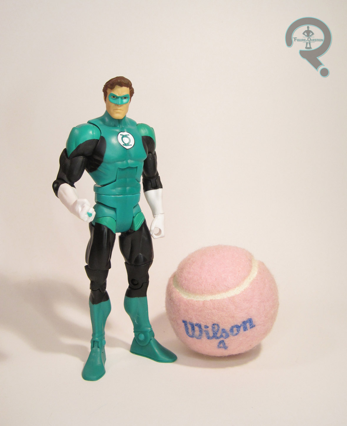
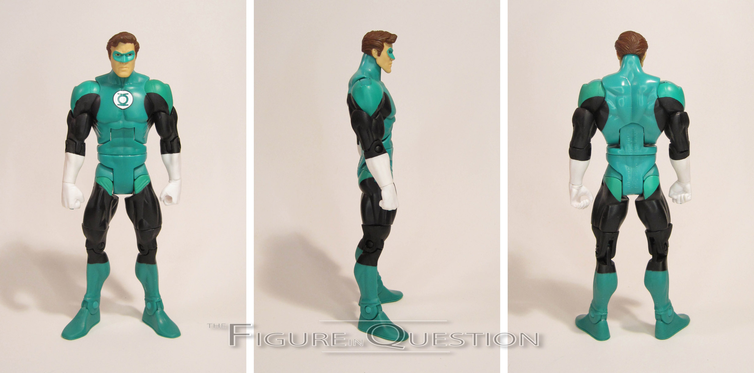
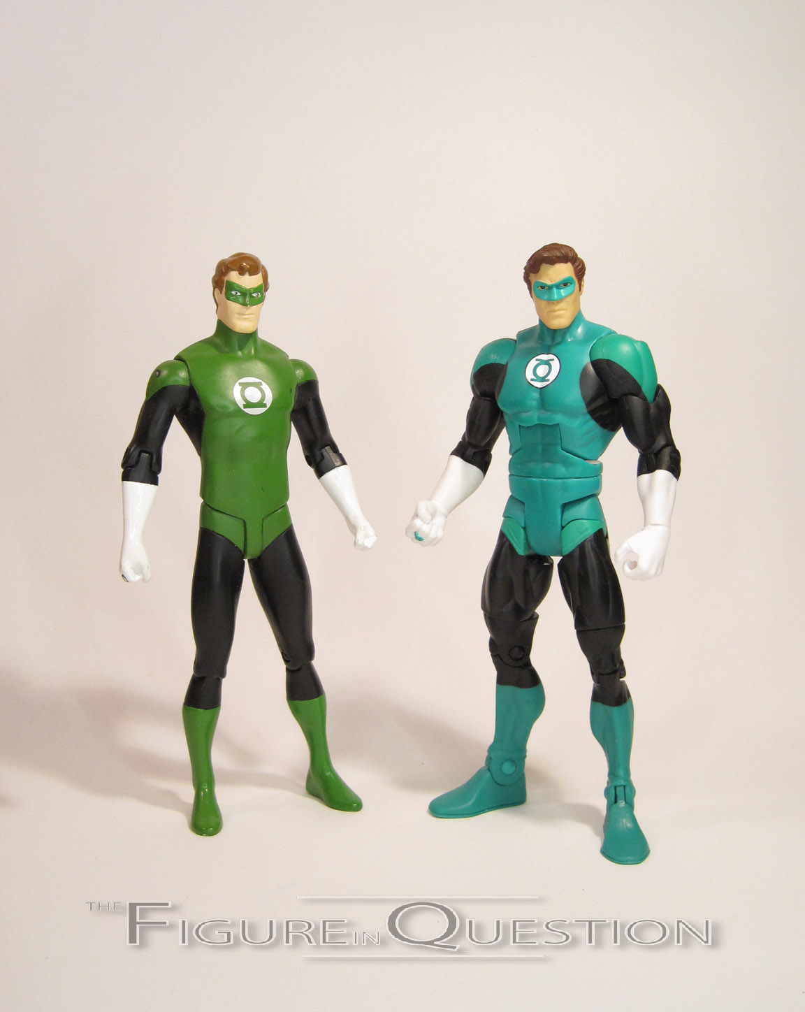
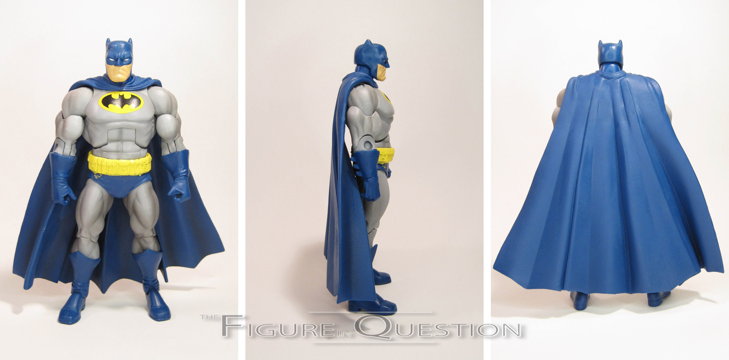
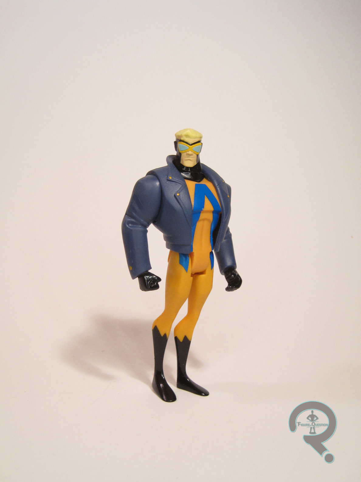
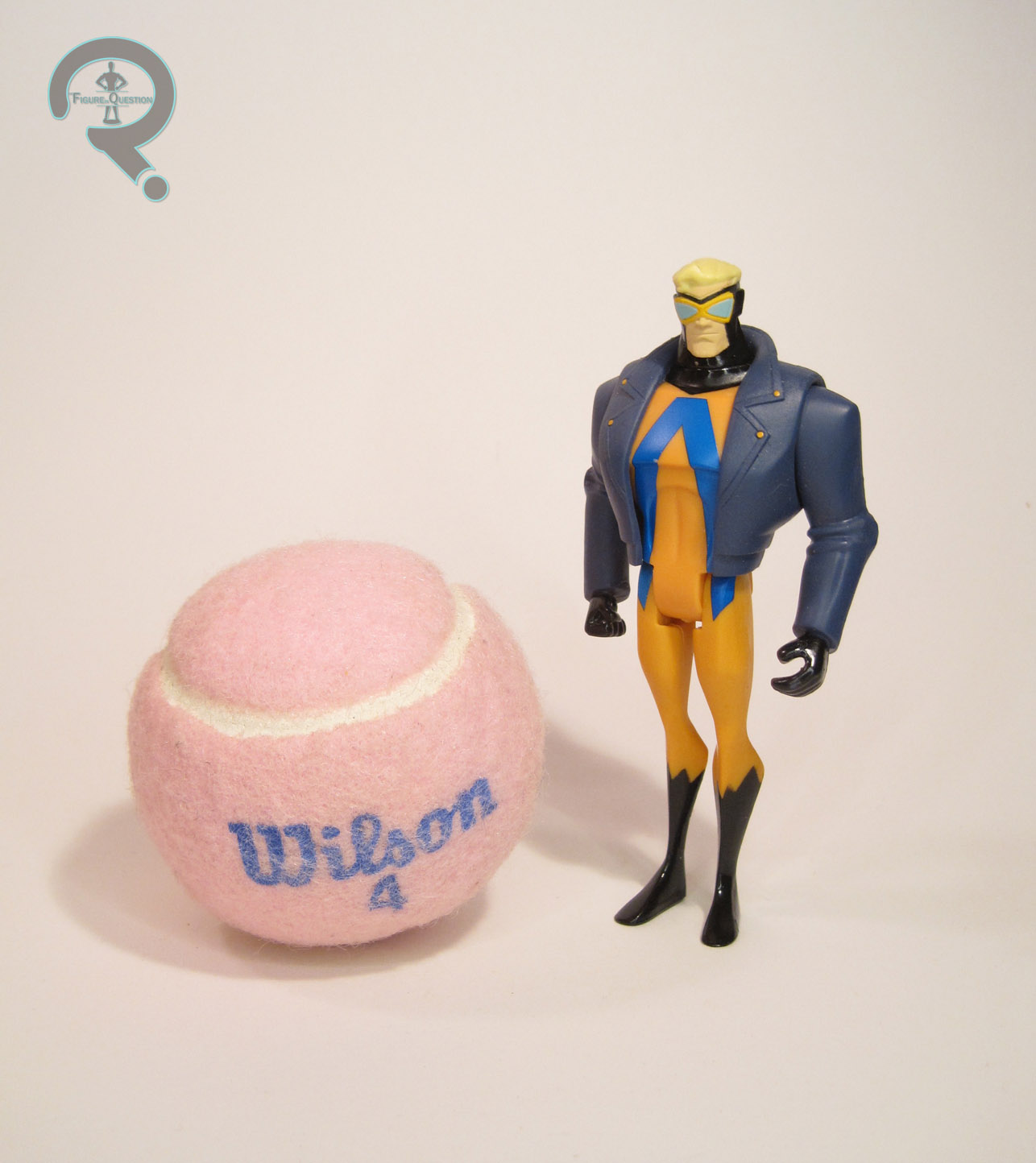
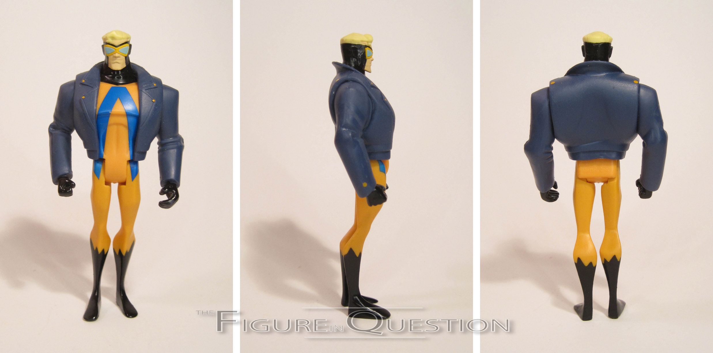
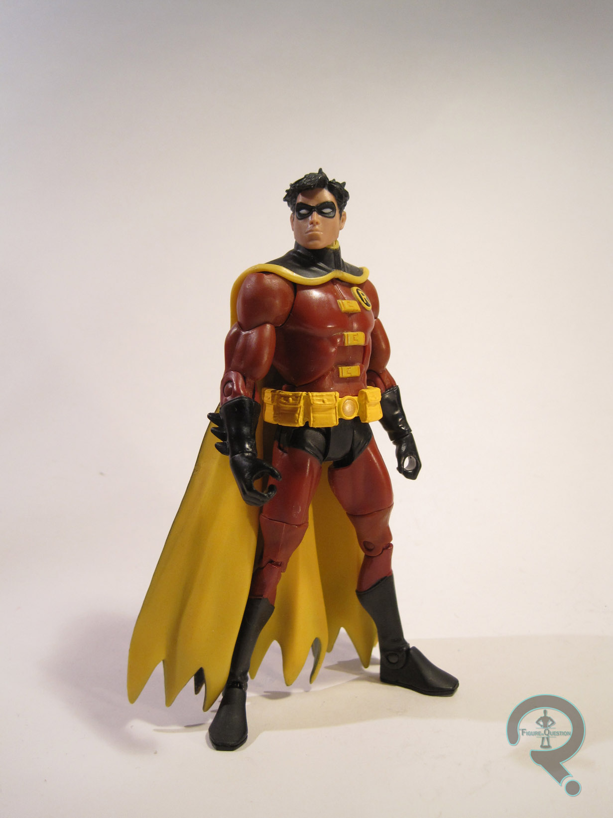
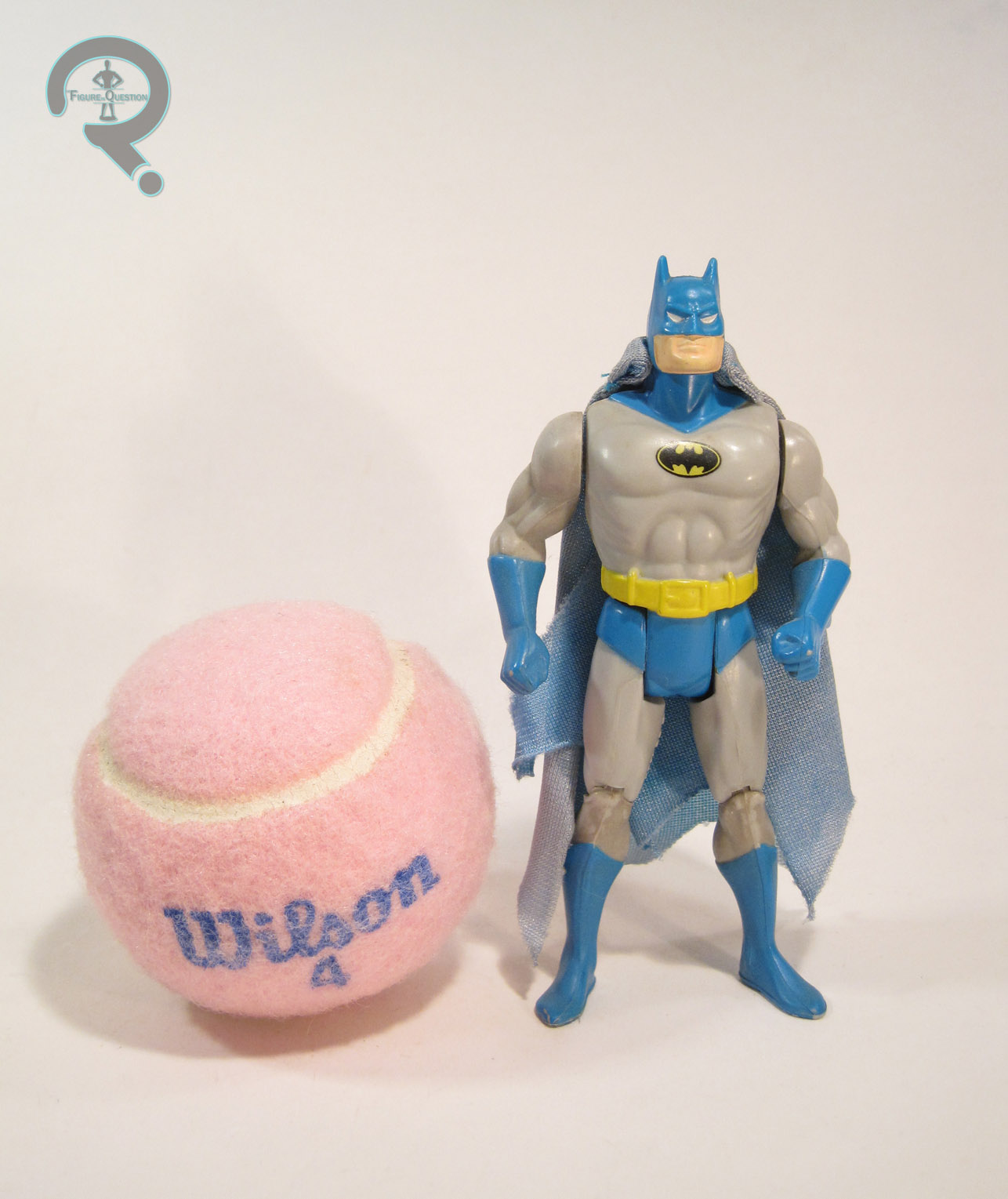
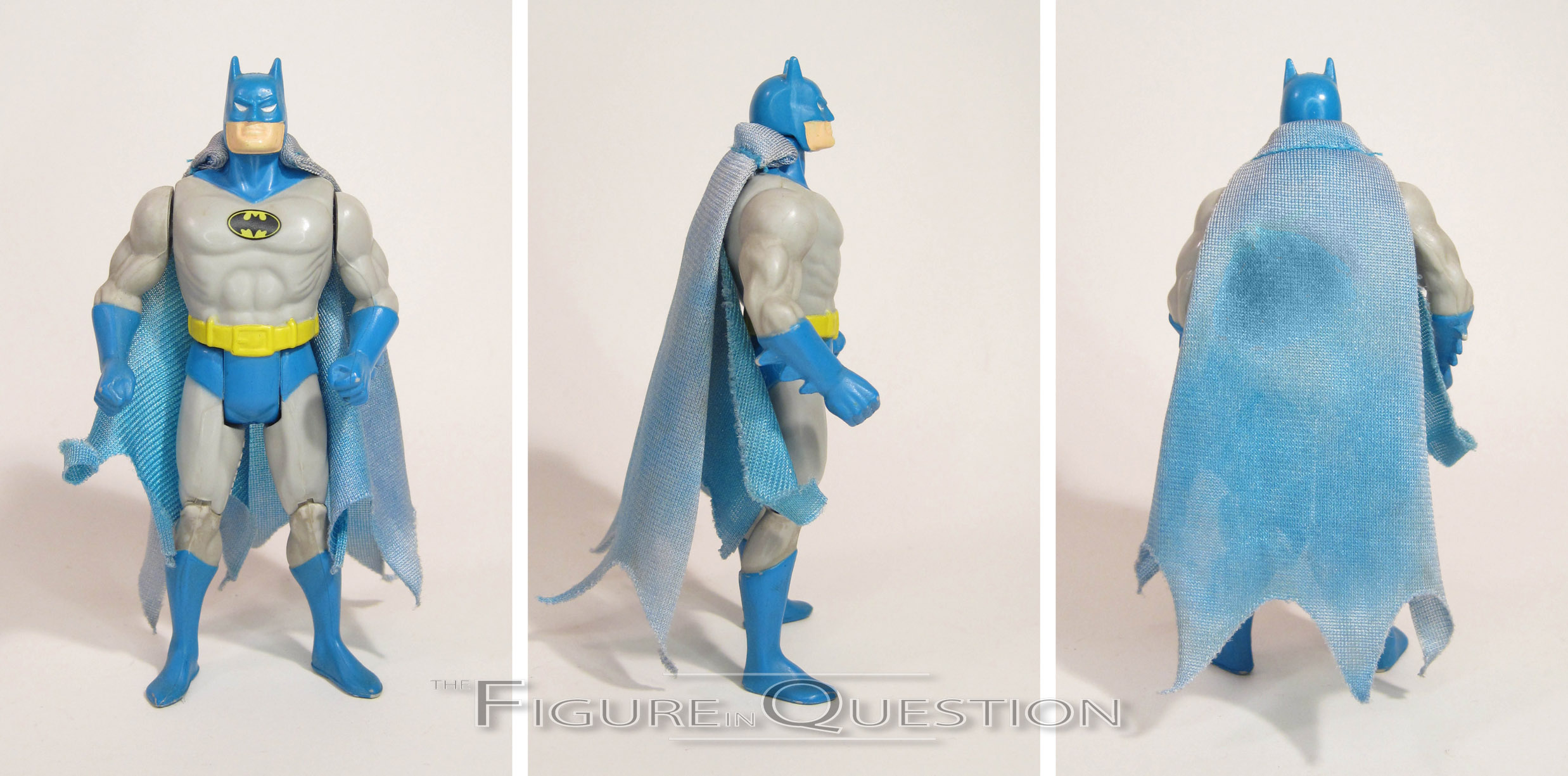
 Superfriends Batman was distributed through the same means as Green Lantern, being a Walmart-exclusive entry in the DC Comics Multiverse line. He, too, would actually stay a Walmart exclusive, unlike the second half of the Super Friends sub-set (who, despite their non-exclusivity, I don’t actually have). Unlike GL, Batman’s a pretty natural choice for this assortment, since Batman was with Super Friends for its entire run, and was a pivotal player in most episodes. The figure stands 6 1/2 inches tall and he has 23 points of articulation. For the most part, his sculpt is a straight re-use of the DC Universe Classics Series 1 Batman, with one small exception. The sculpted cape has been replaced with a cloth one, which has been done in the style of the old Super Powers capes. Not *quite* the right source material, but it’s goofy and fits the general aesthetic. I find myself liking the look of it quite a bit, actually, though it’s definitely not going to be for everyone. AS with Hal, Bats’ mold is definitely showing its age and the wear from all those repeated uses. On my figure in particular, one of the shoulders doesn’t even quite peg together the right way. Batman’s paintwork actually ends up more faithful to the source material than GL, which is a plus. It’s also pretty clean, and likewise very bold. It looks good on this sculpt. I appreciate the return of the black shading on the cowl (it’s true to the show, but I wouldn’t have put it past Mattel to leave it off). Bats even makes out pretty well on the accessories front. To start with, he’s got the same base and backer card as GL (with the same issue with the peg on the stand). The back of both cards has part of the Super Friends logo, so that if you get all four, you have the whole thing. In perhaps the most Mattel move of all, GL and Batman (who, it should be noted, shipped together) don’t have sequential cards, unless of course you really want to celebrate the “Per Inds”. Fortunately, Batman gets more accessories than GL; he also gets a grappling hook and a batarang (and it does *not* have “CHINA” stamped on it, which was a nice change).

THE ME HALF OF THE EQUATION
I grabbed Batman at the same time as GL, from an Ollie’s for $3. I couldn’t just leave him there, now could I? That would have been cruel. Minor issues aside, this figure is actually not terrible. He’s hardly going to be anyone’s default Batman, but unlike GL, he seems to more fully embrace the concept Mattel was going for.