#1132: Thallo

THALLO

CLASH OF THE TITANS (MATTEL)

thallo1

Let’s take another glance into the vault of “movie toys from the 70s and 80s that only exist because of Star Wars”!  Today, we’re going with a line I’ve looked at once before, Mattel’s Clash of the Titans figures, based on the 1981 film of the same name.  Both the movie and its toys were highly ambitious, but neither hit as big as their creators had intended.  The toyline is still pretty fun, though, and gave us some pretty cool Greek mythology figures.  Earlier this year, I took a look at the line’s take on Perseus, and this review takes a look at Thallo, one of his compatriots from the film.

THE FIGURE ITSELF

thallo2Thallo is another figure from the first, and only, series of Clash of the Titans figures.  The figure is a little under 4 inches tall and he has 5 points of articulation.  As with Perseus, Thallo has a sculpt clearly designed to mimmic the Kenner’s Star Wars line, but is ultimately far less sturdy than any of his counterparts from the galaxy far, far away.  He and Perseus share the same arms and legs, which actually works out in Thallo’s favor, because those pieces actually seem to work better on him than they did on Perseus.  The legs in particular meld a little better with the torso on this guy.  I mean, he still looks a little like he’s wearing a squared-off diaper, but it’s not as bad.  Thallo’s unique parts aren’t bad.  The head’s not quite as good as Perseus, but it’s still decent enough, and the helmet is cool.  The torso exhibits some pretty fun details, especially on the front of the armor.  Thallo’s paintwork is kinda meh.  There’s not a whole lot to get excited about there, since it’s pretty much exclusively browns.  Also, his hair is way to dark for Thallo and his eyes are reduced to simple dots, which looks rather on the frightening side, if I’m honest.  It’s not the worst thing Mattel’s ever put out, but it could certainly better, even for the time.  Thallo originally included a sword and shield, which were identical to Perseus’s.  Mine was purchased used, so no accessories for him!

THE ME HALF OF THE EQUATION

I picked up Thallo during the same flea market trip where I picked up Savage Dragon.  In fact, I got him from the same vendor who sold me my Perseus figure earlier this year.  I still haven’t gotten around to seeing Clash yet (I swear I will one of these days!), so I can’t say I know much about the character.  That being said, he’s still a neat little figure, and he goes pretty well with Perseus.

#1131: Solomon Grundy

SOLOMON GRUNDY

JUSTICE SOCIETY OF AMERICA (DC DIRECT)

grundydcd1

“Solomon Grundy; Born on a Monday…”

How many comics characters can claim they come from an 19th Century nursery rhyme?  Not many, if you’re using that rather specific qualifier.  There’s a few, I’m sure, but the most prominent, for me anyway, is Solomon Grundy.  Grundy is one of DC’s older super villains, first appearing as a Golden Age Green Lantern foe, before making his way around a few of the DC rogues galleries.  He’s appeared in both Challenge of the Superfriends and Justice League.  His appearances in the latter show got him a fair bit of notoriety, since he was used as a very cool ersatz Hulk for a few stories.  He’s had a handful of figures over the years, but today I’ll be looking at his very first!

THE FIGURE ITSELF

grundydcd2Solomon Grundy was released at the very end of 2001, technically as part of DC Direct’s then running Justice Society of America line.  Grundy, given his size, was released as a stand-alone deluxe figure.  The figure stands about 7 1/2 inches tall (with the hunch; without, he’d be about an inch taller) and he has 9 points of articulation.  Like a lot of figures from the pre-Marvel Legends era of collectibles, he’s pretty much just a plastic statue, with only one real pose he works in (unless you really like him craning his head like his neck is broken).  The sculpt is unique to this figure, and it’s decent enough.  It’s not really based on any specific artist’s take on the character, but it does a reasonable job of summing up the basics of the classic Grundy design, though he’s clearly got some late ‘90s aesthetic to him.  There’s definitely some odd proportions going on, especially on the legs, which are rather on the gangly side, but then finished off with a rather large set of feet.  Honestly, Grundy’s legs almost feel like they’re from a different figure than his top half.  They’re not only built differently, but textured differently as well.  The coat and shirt have a tone of texture work, but the legs are comparatively very smooth, which seems a little out of place.  Grundy’s paintwork is definitely up there.  There’s not a lot of variance in colors, but he’s got some really clean work all around, and a lot of nice, subtle accent work.  DC Direct really knew what they were doing with paint at this point.  Grundy’s main accessory was a big club of wood, which he could hold in his left hand.  It’s a pretty fun piece, even if it’s not totally essential.  Grundy was also packed with a “preview” figure from DCD’s then-upcoming Pocket Super Heroes line, which was a Silver Age version of Wonder Woman, and was actually one of the major selling points of this figure, oddly enough.

THE ME HALF OF THE EQUATION

I always wanted a Grundy figure when he was new, but never got one for whatever reason.  I ended up picking him up several years later from a vendor at Baltimore Comic-Con, for well below his original retail value (which looks to be even more a of a steal nowadays).  There have been a number of Grundy figures in subsequent years, of varying quality.  This one isn’t a perfect figure, but he’s pretty strong, especially for early DCD. 

#1130: Savage Dragon

SAVAGE DRAGON

LEGENDARY COMIC BOOK HEROES

savagedragon1

Alas, poor Toy Biz, I knew them well.  Their main claim to fame was handling all the Marvel-based figures (at retail, anyway) from 1990 to 2006.  During that time, Marvel had filed for bankruptcy, and ultimately been bailed out by their partners at Toy Biz (who would have been in a bit of trouble had their main licensor gone under).  The two companies became one larger entity, and Toy Biz itself was reformed as an in-house company at Marvel.  They had quite a successful run, but it was eventually decided that licensing out the Marvel properties was more profitable than handling them in-house, and production of Marvel toys was moved to Hasbro.  Toy Biz reformatted as Marvel Toys, and tried to capture the success of some of their Marvel lines (namely Marvel Legends) by applying the same style to a number of independent comics characters, such as the previously reviewed Madman, and today’s focus, Savage Dragon.  Ultimately, the line was not the success they had hoped, as most general audiences who shopped at the likes of Walmart and Target weren’t really looking to buy figures of Ripclaw or SuperPatriot, leading to quite a few unsold figures and the eventual closing down of Marvel Toys.  That’s a bit of a downer.  Let’s look at a toy to cheer up!

THE FIGURE ITSELF

savagedragon2Savage Dragon was part of the first series of Legendary Comic Book Heroes, and was kind of one of the flagship characters featured therein (alongside Judge Dredd and Witchblade).  As one of the earliest creations from Image, his presence in this line made a lot of sense.  This wasn’t actually his first figure (he got his own line from McFarlane back in the ‘90s); matter of fact, I believe it’s the last of his figures.  Also, there were two versions of Dragon available: with or without shirt.  I’ll be looking at the shirtless figure, the more common of the two.  The figure stands about 6 3/4 inches tall (not counting the 1-inch head fin) and he has a whopping 50 points of articulation.  I think that might have been a record for a Toy Biz/Marvel Toys figure.  18 of those points come from his fingers alone, which is quite impressive.  Many of the figures in this line made use of Marvel Legends tooling, but Savage Dragon got his own unique sculpt.  It’s not a bad sculpt, though it’s worth noting that he’s a fair bit more conservative in his proportions than Dragon is frequently depicted.  They’re still very exaggerated, of course, with the arms being roughly twice the size of the legs.  The articulation is worked in alright (better than many of TB’s Marvel Legends figures), but the hands definitely look a little like someone stepped on them in certain poses, but they look fine in a number of poses.  The paintwork in Dragon is pretty nice.  TB could be hit and miss, but this was one of their better ones.  All of the hair on his chest and arms is painted, and it does a decent enough job of capturing his rather hairy look from the comics.  The jeans have a nice wash on them, which suggests the proper texturing quite effectively.  The only part that I’m slightly letdown by is the shoes, which are clean overall, but just lack some of the finesse of the rest of the figure.  Savage Dragon was originally packed with a leg of the first series Build-A-Figure Pitt, which was not included with my figure, as I bought him after the fact.

THE ME HALF OF THE EQUATION

As I noted when I reviewed Madman, I missed LCBH in its initial run.  I mean, I saw them everywhere at the time, but I just never bought any of them (mostly because I pretty much knew none of the characters at the time).  I still have only a marginal knowledge of Savage Dragon, but I’ve become more appreciative of obscure figures, so when I found him at a flea market, I felt urged to pick him up (it helped that he was $5).  He’s actually a really fun figure, and between him and Madman, I’m really tempted to track down more of this line.

#1129: Wolverine & Thunderbird

WOLVERINE & THUNDERBIRD

MARVEL MINIMATES

wolvthunderbird1

Happy Thanksgiving to all of my American readers out there!  And, to all my non-American readers, happy Thursday!  Hey, there’s nothing wrong with some general positivity, right?  Today, I’m wrapping up my Giant Size X-Men Minimates, which includes Thunderbird, the team’s Native American member.  Him being half of the set I’m looking at today is really just a coincidence, but it works out, I guess.  And hey, it gives me a chance to post this Bulletin Bits strip, featuring Thunderbird’s brother Warpath!

mmbb28

Alright, so let’s have a look at Thunderbird and his pack-mate Wolverine!

THE FIGURES THEMSELVES

Wolverine and Thunderbird are the fourth and final set in Series 68 of Marvel Minimates.  These two make for an interesting pair.  While Thunderbird famously died during the team’s second mission (spoiler on a 41 year old  comic, I guess), Chris Claremont has gone on record that both Thunderbird and Wolverine were on the chopping block for issue 95’s fatality.  Wolverine was ultimately only saved by having a slightly more defined power set than Thunderbird.  Imagine how different the X-Men might have been had those roles been reversed!

WOLVERINE

wolvthunderbird3Wolverine is no stranger to Minimates, with this particular ‘mate being his 59th entry in the line.  It’s also out fifth version of his basic Tiger-Stipe look, but it’s the first one in a little while, and, as with the others in this series, he’s specifically patterned after Dave Cockrum’s illustrations.  The figure is about 2 1/2 inches tall and he has 14 points of articulation.  He has add-ons for his mask, shoulder pads, clawed hands, and boots.  All of these pieces are from the Series 28 version of this costume.  While that was 7 years ago, the pieces still work, so the re-use is more than warranted.  The mask could, I suppose, be a little more streamlined, as it was in the ‘70s, but at this scale it’s negligible.  Wolverine’s paintwork is pretty great all-around.  The colors are a good match for the classic Wolverine, and the line work does a very nice job of translating Cockrum’s drawings into the ‘mate form.  I will say, he definitely looks better with the mask on than without.  There’s something about the unmasked look that’s a little off.  Of course, I’ve got plenty of unmasked Wolverines, so a good masked one is fine by me.  Wolverine includes an extra hairpiece for his unmasked look, as well as a clear display stand.  It feels rather on the light side, especially compared to some of the others in the series.  At the very least, a spare set of normal hands should be standard, and I would have also appreciated the hanging mask piece from the Series 47 Wolverine, just to give him some extra display options.

THUNDERBIRD

wolvthunderbird2This marks Thunderbird’s second time as a Minimate, after his figure in the GSXM boxed set.  Given his relative obscurity, it’s not really much of a surprise.  That being said, that figure’s been rather outdated for quite some time now, so an update is very much appreciated.  The figure uses add ons for his hair, sleeves, belt, and boots.  The belt is a standard piece, but the rest of the parts are new to this figure.  They look pretty good, and certainly do a nice job of capturing Thunderbird’s look from the comics.  This new method of construction works a fair bit better than the way the costume was handled not he first Thunderbird ‘mate.  The paint work on Thunderbird is pretty well handled.  The colors are certainly vibrant, and I appreciate that his skin tone is a little different from the rest of the figures in the series.  I also appreciate the Cockrum-style shading on the various parts of the costume.  It takes him from a potentially “meh” ‘mate to a pretty interesting one.  Thunderbird’s only accessory is a clear display stand.  That being said, I can think of pretty much nothing else that a Thunderbird figure really should have, so he doesn’t feel unnecessarily light (the fact that he has quite a few new pieces helps a fair bit too).   

THE ME HALF OF THE EQUATION

This is probably the set from this series I was the least excited for.  I’ve got plenty of Wolverines, and as cool as Thunderbird is, he’s never been near the top of the list of figures I needed.  In hand, I do really like both of them to be sure.  Wolverine will be my definitive version, and Thunderbird definitely feels like a solid ‘mate all-around.  That being said, compared to the more parts heavy sets in the series, these two do feel like the come up a bit short, especially since half of the set is a character we’ve gotten 58 times before, in a costume we’ve gotten four times before, built entirely out of re-used parts.  This set could definitely have used a little something extra to help it pop.  It’s not bad at all, but it is a little less exciting than the others.

anadxmenmates

#1128: Colossus & Nightcrawler

COLOSSUS & NIGHTCRAWLER

MARVEL MINIMATES

nightcrawlercolossus1

The X-Men line-up presented in Giant Size X-Men #1 undoubtedly gave us some of the more memorable X-Men.  Obviously, there’s the likes of Storm and Wolverine (even if he did appear elsewhere first), but it also gave us both Colossus and Nightcrawler.  While they may not be quite as big as some of the others (and poor Colossus has been woefully overlooked when it comes to the cartoons), they’re still pretty popular with the fanbase at large.  They also happen to be two of my favorite X-Men, so packing them together is pretty awesome!

THE FIGURES THEMSELVES

Colossus and Nightcrawler are part of Series 68 of the Marvel Minimates line, which is based around GSXM #1.  Both figures are based on their Dave Cockrum-designed looks, but it’s worth noting that these two stuck with these particular looks for a good long while.

COLOSSUS

nightcrawlercolossus3Colossus has had a few different ‘mates over the years.  That being said, this is the first one to directly retread on previous territory, being a pretty straight re-do of the GSXM boxed set version (the alt look for the Series 47 version came pretty close, but was actually based on his slightly tweaked ‘90s look).  The figure is built on the standard ‘mate body, and as such stands about 2 1/2 inches tall and has 14 points of articulation.  Colossus features add-on pieces for his hair, wrist bands, torso cover/belt, and boots.  The hair and gauntlets were both used on the 47 Colossus; they worked well there and they work well here.  The torso piece and boots are both new to this ‘mate.  It’s interesting: after getting several attempts at handling the torso piece a “better” way than the GSXM set’s version, they just went back to essentially the same style.  I’m certainly not complaining!  I do like the subtle hints of musculature on the chest piece, which make him seem larger than the others, but prevents him from looking puffy.  I’m not 100% sold on the boots.  Something about the knee pads seems off to me.  There’s certainly been worse, though.  Colossus’s paint is very impressively handled.  The colors are nice and bold, and he really pops.  The line work is very sharp, and the details, the face in particular, are a very good rendition of Cockrum’s Colossus.  I was very happy to find out that the actual torso has full detailing, allowing you to display Colossus shirtless, if you so choose (some people like that sort of thing).  Colossus’s only accessory is a clear display stand, which feels rather light.  Obviously, the parts for an un-armored Piotr would make him essentially a second figure, but the fastball special hand should have been included at the very least.  Oh well.

NIGHTCRAWLER

nightcrawlercolossus2Amazingly enough, this is only the third time we’ve gotten Nightcrawler (and the third time we’ve gotten this exact costume too, no less).  I thought the Excalibur set version had him pretty well covered, but it’s been over five years since that one was released, so another version feels warranted.  Nightcrawler has  unique hands and feet, as well as sculpted add-ons for his hair, shoulder pads, and tail. The tail remains the same piece used on both prior Nightcrawlers (and his dad Azazel), but everything else is new to this figure.  Personally, I prefer the Wolverine-style shoulder pads from the last Nightcrawler to the ones featured here (I like the neck to be left unencumbered as much as possible), but they’re a decent enough piece, I suppose.  The hair, hands, and feet are all improvements over what we’ve gotten before (the hands especially, since the prior hands are huge) and are just well sculpted all around.  The ears could maybe stand to be a little more pronounced, but that’s the only real negative I’ve got.  Nightcrawler’s paintwork is pretty good, but not without its issues.  The basics are all pretty good.  The color palette is bright and bold, and the colors accent each other well.  His basic head has a frightening expression we haven’t yet seen on a Nightcrawler ‘mate.  It’s a good rendition of the earlier, scarier NIghtcrawler, and it makes this figure a little more specific to those appearances (thus giving the figure a bit more reason to exist).  Unfortunately, the application of a lot of the paint, especially the red, is a little uneven.  The red detailing on the edges of the gloves and boots is far too thin, resulting in an obvious line where the underlying colors switch from white to black.  That, coupled with the fact that the glove trim stops abruptly for the inner half of the arm, makes him look a little unfinished.  Nightcrawler includes an extra head with a more jovial expression (my preferred of the two faces), a cutlass (finally!), a “bamf” stand, and a clear display stand.  All of these are pretty cool, except the “bamf” stand, which is more than a little frustrating, since the peg is too small for either foot, and it also requires him to stand with both feet together, a rather un-Nightcrawler stance.

THE ME HALF OF THE EQUATION

Though I missed out on the GSXM set, I wasn’t missing either of these characters, having picked up their subsequent releases.  Colossus was a pleasant surprise.  There was something missing from the ‘mates since the GSXM version, which I think has been found again with this guy.  He’s the perfect embodiment of the character.  I don’t see him being replaced any time soon.  Nightcrawler is a more mixed figure than Colossus.  I’ve never really cared for the original ‘mate, but the Excalibur version was pretty solid.  This one adds some nice stuff (the extra head, the new hands and feet, and the cutlass), but also takes a few hits (the paint, the effects base, and, if I’m being really picky, the shoulder pads).  The good outweighs the bad, but he could still be a bit better.

#1127: Storm & Sunfire

STORM & SUNFIRE

MARVEL MINIMATES

stormsunfire1

One of the more intriguing aspects of the “All New, All Different X-Men” presented in Giant Size X-Men #1 was the diversity of the team.  This was especially poignant in comparison to the original team.  While the X-Men (and Mutants in general) were supposed to represent groups who were oppressed, shunned, and otherwise mistreated, the actual original team was made up entirely of upperclass, good-looking, and generally well-off whites, which ever so slightly hindered the message the creators were trying to put forth.  When the new team appeared with members representing cultures from all over the world, it really helped to sell the inclusiveness of the whole idea, and redefined how the team was portrayed moving forward.  Many of these new characters became some of the most memorable characters in the franchise’s history, including Storm, who I’m looking at today.  Then there’s Sunfire, who is…less memorable….

THE FIGURES THEMSELVES

Storm and Sunfire are part of the 68th series of Marvel Minimates, which is GSXM-themed.  Both characters are based on Dave Cockrum’s renditions of the characters from Giant Size X-Men #1, though, like with Banshee yesterday, Sunfire’s design was just a slight tweak on his design from earlier in the original run.

STORM

stormsunfire3Aside from Wolverine, Storm is easily the most memorable of the characters brought onto the team in GSXM #1 (and she’s definitely the most memorable of the characters *introduced* in GSXM #1).  To date, she’s held a prominent role in every cartoon adaptation, and had a role in five of the six movies (and she even cameoed in the sixth).  That’s important!  She’s also had 9 prior Minimates, covering most of her prominent looks, which is better than can be said for quite a few Marvel characters.  Being built on the standard Minimate base body, Storm stands about 2 1/2 inches tall and has 14 points of articulation.  Storm gets add-on pieces for her hair and cape.  Both of these pieces are new to this figure, and they look quite good.  Some figures of this storm design downplay the length of her hair, which is always a little frustrating, so I was grad to see this one doesn’t.  The basic cape included here is decent enough, if perhaps a little rigid.  Fortunately, for those who want Storm’s cape to be a little more flowy, there’s also a much larger, flying cape included.  It’s definitely my preferred piece of the two, and it really sets this Storm apart from the others we’ve gotten.  Storm’s paintwork is pretty solid all around.  All the colors are great matches for what’s seen on the printed page, and I really like the glossy sheen on the black parts of her costume.  This figure probably has some of the best paintwork in the series.  In addition to the extra cape, Storm also includes an extra head (w/ pupils), two electricity pieces, a flight stand, and a clear display stand.

SUNFIRE

stormsunfire2Sunfire here pairs up with Banshee on the whole “left off of the cover” business, meaning he was also left out of the original GSXM boxed set.  Unlike Banshee, this is actually his very first Minimate (and only his fifth action figure in general).  Sunfire’s never been all that prominent, since he quit the team after only an issue, and never really came back, so no real action figure coverage for him.  He’s probably not helped by his costume have the rising sun motif, but there it is.  The figure gets an all-new add-on piece for his weird looking mask.  It does a decent job of trying to make sense of that goofy thing.  Could this be the first time that a Minima’s lack of nose actually makes his costume make more sense?  The rest of the details are rendered via paint, which is all pretty solidly handled.  The white parts could be a little cleaner, and the orange could maybe stand out a bit more, but the line work is really great.  Under his mask is an appropriately angry Shiro Yoshida.  That guy was alway pissed.  For accessories, Sunfire gets an extra hairpiece for an unmasked look, two flame effect pieces for his hands, an orange-tinted flight stand, and a clear display stand.

THE ME HALF OF THE EQUATION

Ever since missing out on the GSXM set, I’ve been waiting on a good classic Storm, and when this one was announced, I was pretty psyched.  I can’t say I’m disappointed with the final product.  Definitely the best version of the character yet.  And, getting Sunfire after so long is also pretty darn cool.  He’s no one’s favorite character, but he’s an important piece of the team’s history nonetheless, and it’s great to finally have him!

#1126: Cyclops & Banshee

CYCLOPS & BANSHEE

MARVEL MINIMATES

bansheecyclops1

In the summer of 2003, Marvel Minimates was launched, with Series 1-3 all hitting pretty much simultaneously.  It was an interesting mix of characters and eras to be sure, but that’s a story for another review.  Series 3 gave us our first taste of the X-Men, presenting them in their Ultimate X-Men incarnation, which was a little bit of a letdown for the more classic comics fans in the audience.  Fortunately, in January of the following year, they got back to the X-Men, this time offering up a set based on Giant Size X-Men #1, perhaps the quintessential “classic” X-Men.  Now, 13 years later, they’ve returned back to GSXM #1, this time offering up a whole series of two-packs based on the team.  Today, I’ll be looking at the first two-pack from the set, leader man Cyclops & Banshee!

THE FIGURES THEMSELVES

Cyclops and Banshee are part of the 68th Series of Marvel Minimates, which hit towards the end of September.  Both characters are based on their Dave Cockrum designs from the early issues of his and Chris Claremont’s run on X-Men, though, in the case of Cyclops and Banshee, both designs are slight tweaks of the Werner Roth designs for the characters.

CYCLOPS

bansheecyclops6
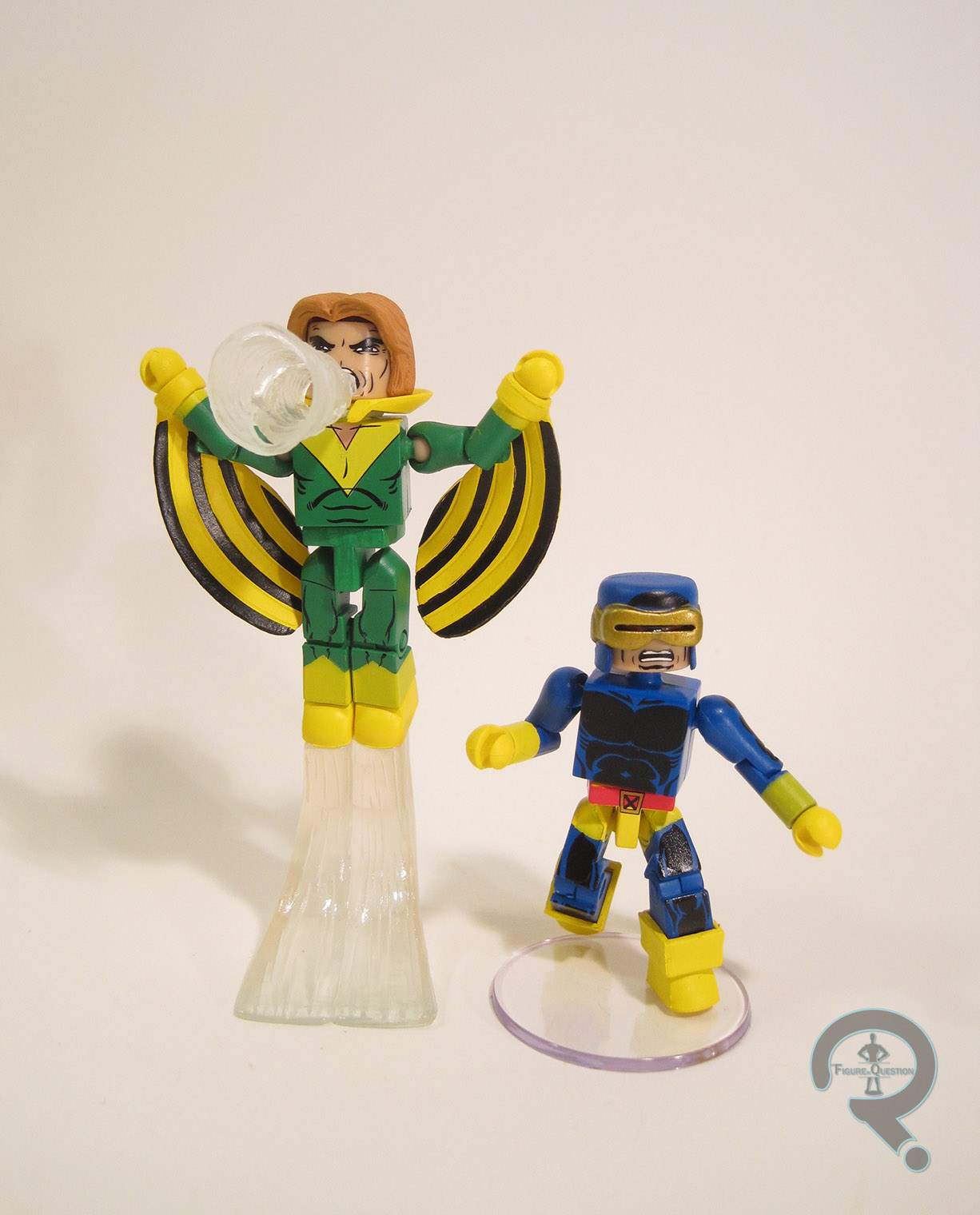
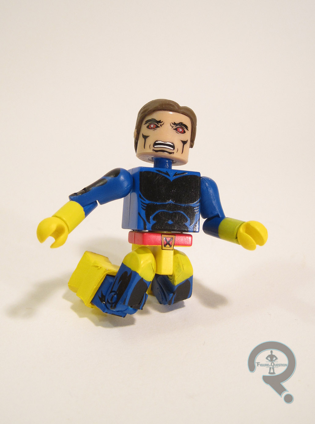
When it came time to rebuild the team, Cyclops was the one point of overlap between old and new (though Jean Grey would find her way back in short time, and Beast and Angel would both pull stints as recurring members.  Only Iceman really stayed away), kept on as the new team’s field leader.  It gave him a sense of seniority he hadn’t really had with the prior incarnation of the team.  This particular Cyclops design has graced the Minimate style twice before, but the last time was as part of an exclusive two-pack in 2005.  Minimates have made a lot of progress since then, so the update to what is probably Scott’s most prominent design is a much appreciated one.  The figure stands about 2 1/2 inches tall and he has 14 points of articulation, as is the norm for any figure built on the standard ‘mate body.  Cyclops has additional parts for his cowl/visor and his boots.  The boots are the standard cuffed boots, and they do the job well enough.  The mask is a new piece, and it does quite a nice job of both capturing the feel of Cockrum’s illustrations of Cyclops’ visor, while also still fitting in well with the general Minimate aesthetic.  The rest of Scott’s details are handled via paint.  The overall application is pretty good, but there are a few issues, such as his left glove not getting enough coats of yellow to totally cover the underlying blue, thereby giving him a slightly green color.  Also, like a few previous X-Men, his belt buckle still has some traces of yellow left at the very bottom, which is a little frustrating.  That being said, there’s a lot to like here.  The shading on the blue sections of the costume is very near perfect, and really sells this as a late 70s Cyclops, as well as adding a lot of depth and dimension to the design.  While the gold visor has occasionally been something that bothers me on Cyclops figures, this is one time I really don’t mind, as Cockrum always went out of his way to indicate the visor was metallic.  I also appreciate the little red visible “eyes” in the visor, as they signify this is undoubtedly a Cockrum Cyclops, not Byrne.  Under the mask, there’s a face that’s a pretty great recreation of the unmasked Cyclops we see near the beginning of GSXM #1.  I really like the extra attention to detail on this one.  Cyclops includes a spare hairpiece for his unmasked look and a clear display stand.  The AvX and ANAD Cyclopses both included an extra mask with an optic blast attached, which certainly would have been nice, but given the number of extras included with the other figure in the set, it’s not the worst thing ever.

BANSHEE

bansheecyclops3
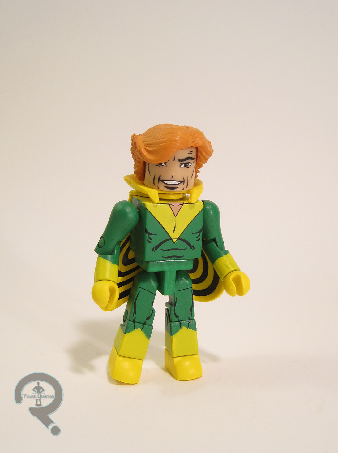
Banshee was one of two members of the new team to have already appeared in X-Men prior to to GSXM#1, so he wasn’t one of the new characters paraded on the oh so famous cover.  By extension, he was also left out of the GSXM boxed set back in 2004, and left unreleased until Series 60, last year.  And even then, that was in his Strike Force uniform, making this particular ‘mate 13 years in the making.  Alright!  Guess my focusing on the positive worked!  Banshee gets add-ons for the hair, collar, and his wings.  The hair and collar come from the “Strange Tales” Morbius. They work decently enough.  I personally prefer the hair used on the last Banshee ‘mate, but the Morbius piece is a good match for Banshee’s appearance bansheecyclops5earlier in the run.  The wing pieces are new.  The slip over the wrists, and when positioned correctly, look like he’s using them to glide on the air.  Pretty cool new pieces, definitely.  The paintwork on Banshee is pretty good in general.  There are some fuzz edges here and there, and there’s a weird sort of film on the pelvis piece, but otherwise, the line work is sharp, and the colors are nice and bold.  Banshee’s default face is screaming, which is pretty well handled.  He also includes an extra head, with a more playful grin, a perfect recreation of Cockrum’s depictions of Banshee off-duty.  I can’t begin to tell you guys how excited I am to have a Banshee that includes an extra, non-screaming head.  How this is the first version of the character to do such thing, I’ll never know.  In addition to the extra head, Banshee also includes the cape and sonic scream piece from the last Banshee, as well as a flight stand and a clear display stand.

THE ME HALF OF THE EQUATION

For quite some time, one of my main wants from Marvel Minimates was a GSXM-themed series.  For a number of stupid reasons, I never owned the original boxed set, so there was this sort of a hole in my collection.  So, I was pretty thrilled by the announcement of this set. Moreover, I’ve been waiting for this Banshee pretty much since 2004, so I’m very happy to have him finally.  He’s definitely the Banshee I’ve been waiting for.  Sorry Strike Force Banshee, looks like you’re being replaced (well, maybe I’ll keep that hair).  The John Byrne Cyclops from 2005 has been my go to version of the character for over ten years, and he’s become increasingly outdated as the line’s moved on.  I was eagerly awaiting the new version, and I’m very happy with the final result.  This one’s going to be hard to top moving forward!
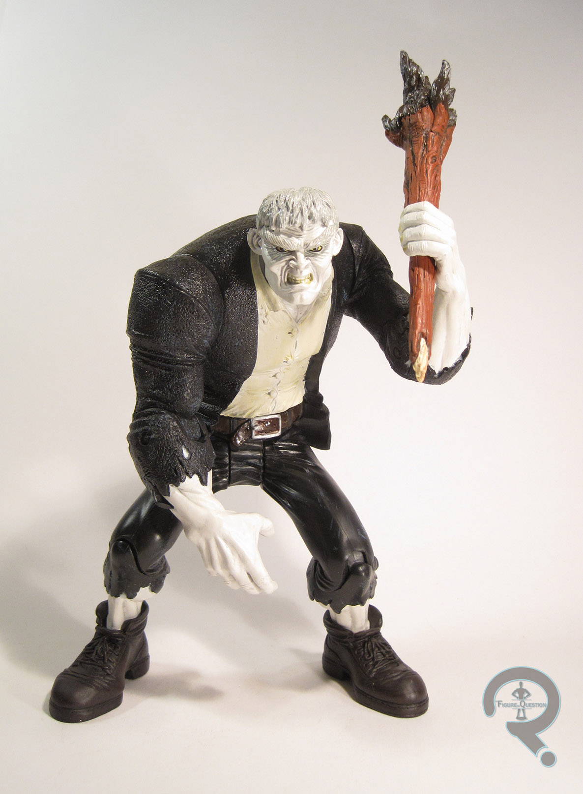
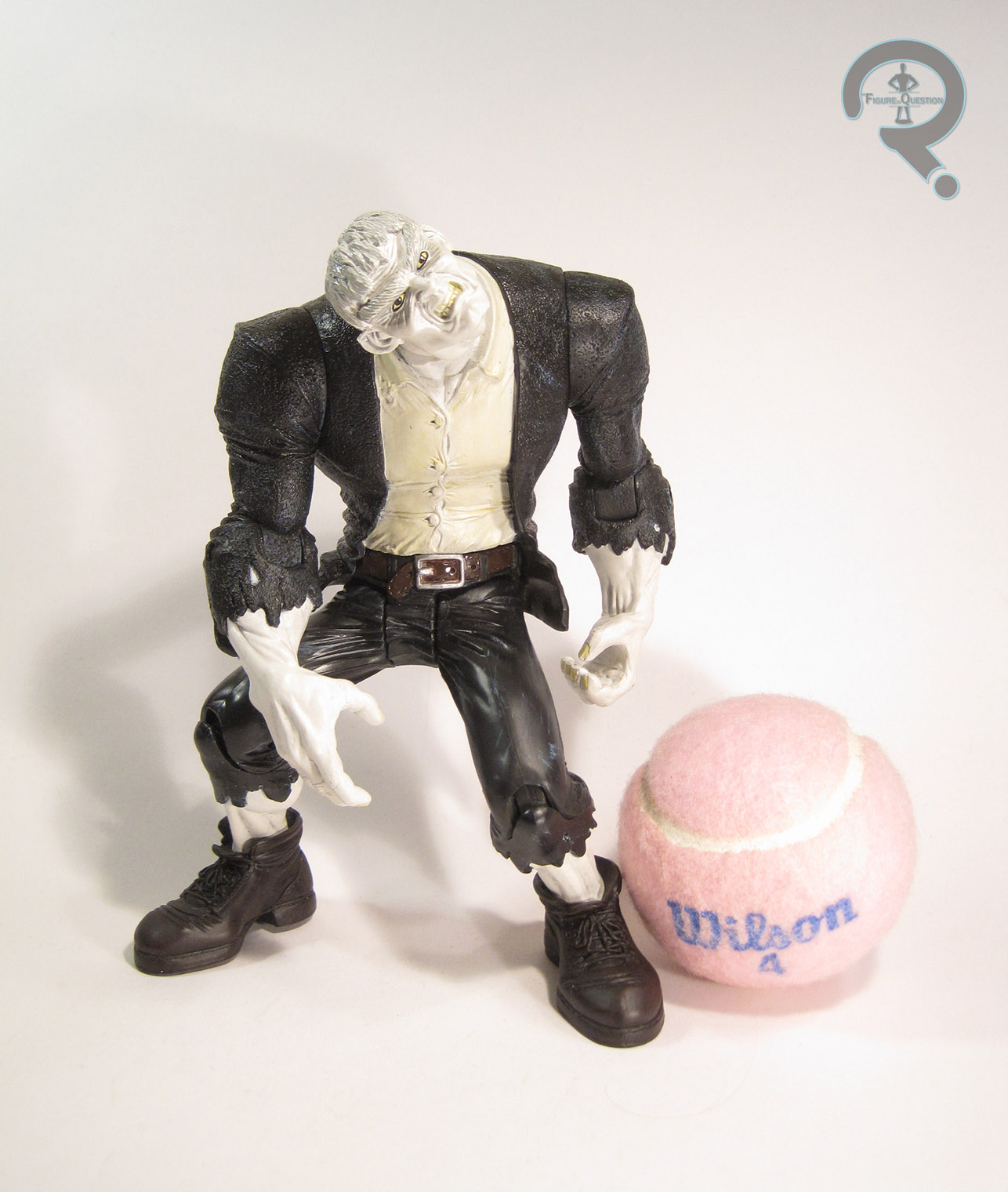
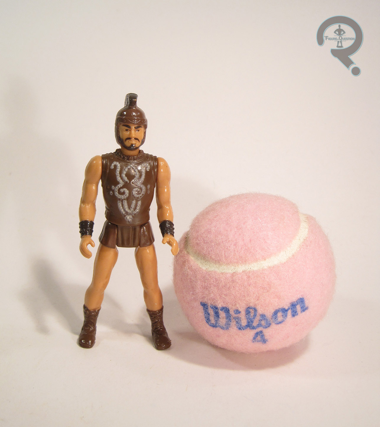
bansheecyclops9

#1125: Spider-Man – Black Costume

SPIDER-MAN – BLACK COSTUME

MARVEL SUPER HEROES: SECRET WARS (MATTEL)

symbiotespideysw1

It’s a rare occasion for a character to have not one, but two of the best known looks in comics under his belt, but that’s the case with everyone’s favorite web-head, Spider-Man.  His original design is clearly his best known, and the one that most people will associate with him.  But, in 1984, Marvel decided to give him a new design.  Coming out of their (toyline tie-in) Secret Wars maxi-series, they introduced a new, black and white costume.*  Obviously, it was never going to replace the original, but it did stick around for a surprising amount of time.  It’s also made quite a few reappearances in comics and other media adaptations, and even gotten spun off into a totally new character, because, let’s face it, it’s a badass design.  Due to the aforementioned badassery of the design, it’s also shown up more than a few times in action figure form.  Today, I’ll be looking at the very first one ever released.

THE FIGURE ITSELF

symbiotespideysw2Spider-Man was released as part of the second series of Mattel’s Marvel Super Heroes: Secret Wars line.  He was the second version of Spider-Man in the line (following Series 1’s standard Spidey), and it should be noted, he’s the only repeat character that the line produced.  The figure stands about 4 1/2 inches tall and has 5 points of articulation.  Structurally speaking, he’s the exact same figure as his Series 1 counterpart, which in turn means he’s very similar to just about every other figure in the line, for good or for bad.  This means the general quality of the sculpt is rather on the soft side.  In their defense on this particular figure (oh my gosh, I’m defending Mattel.  Kill me now), it’s not like the are a lot of really sharp details that should be present.  A generally smooth sculpt is the way to go.  Why Spider-Man is sporting the same build as Captain America and Iron Man is a different question entirely, though.  Spidey gets his own set of legs. You can tell because there’s sort of a pre-posed nature to them. He’s doing some sort of brisk walk or maybe a lunge.  I’m not really sure.  Also, his right arm seems a bit longer than the left.  It’s weird.  All that being said, the overall appearance of the figure’s not bad.  Even his paint’s not awful, although that’s mostly by virtue of the design being rather simple.  It’s worth noting that he’s missing the white blocks on the backs of his hands, admittedly a minor detail, but missing nonetheless.  Also, his logo rather abruptly stops for about 1/4 of an inch on his sides before starting on the back, which is a little weird looking.  And, as with so many Secret Wars figures, the paint is incredibly prone to wear.  Spidey’s only accessory was the big, goofy lenticular shield that every figure included.  His was bright red, because why bother to match the figure, right?

THE ME HALF OF THE EQUATION

Okay, you know how I kick off this section of every Secret Wars review by swearing up and down that I’m not trying to collect this line?  Yeah, you can scratch that on this guy.  He’s a figure I’ve been eying up for some time, mostly due to the coolness factor of the costume.  He ended up being purchased for me by my Super Awesome Girlfriend, who picked him up this summer from Yesterday’s Fun.  I know I’m down on Mattel, and I’ve never been particularly kind to their Secret Wars figures, but this guy is very possibly the strongest entry from the line.  Yeah, he still showcases many of the same problems that plagued pretty much every single figure in the line, but if you view him as his own, standalone figure, he’s not awful.  He’s almost kind of charming.

#1124: Throne Room Battle (w/ Superman & Darkseid)

THRONE ROOM BATTLE (W/ SUPERMAN & DARKSEID)

DC C3 CONSTRUCTION

supermanvsdarkseid1

DC Minimates are kind of a tale of woe and misfortune.  Despite the best efforts of a good number of people, the concept has never really taken off the way other Minimates properties have.  There have been some strong attempts, but there always seems to be something a little off with the execution.  Back in 2004, thanks to some tricky legal mumbo-jumbo, DC Minimates couldn’t be released in a straight forward fashion.  The only way to get them made was to make them the included figures in a line of Lego-style construction sets, dubbed “C3” (for “Create, Construct, Customize”).  I’ve looked at a couple of the ‘mates from those sets, but haven’t looked at a whole set as of yet.  That changes today, with this here review of the Throne Room Battle and included ‘mates Superman & Darkseid.

THE SET ITSELF

The Throne Room Battle set was one of the first seven sets in the DC C3 Construction line.  It’s noteworthy for being the only of those seven sets not to be Batman-themed, and also for being one of the two sets in the first assortment to be based on the then running Justice League cartoon, albeit somewhat loosely.

THRONE ROOM

The main bulk of the box is taken up by the Throne Room for which this set is named.  While the Batman sets were themed around a number of his distinctive vehicles and the always popular Batcave, the Throne Room seems a little bit out of left field, since it’s hardly something that most people would consider a signature Superman locale.  I guess it’s a good way to give us Superman and Darkseid, and it’s certainly a better use of the building set theme than some of the later entries in this line, but this is probably the furthest stretch in the first series.  The Throne room is constructed from 41 pieces (the box lists 67, but that’s counting the parts used for Superman and Darkseid), and the final product is based on Darkseid’s throne room as seen in the Justice League episode “Twilight”.  It’s not an overly complicated set to build, nor is it anything particularly astonishing supermanvsdarkseid2once completed.  The bulk of the work goes into the actual throne, which is decent enough.  It’s designed to be removed from the base (on purpose, not just in the “well, they’re all Legos” sort of fashion), which makes for an interesting feature, I suppose.  The base is made from four smaller flats, and doesn’t really offer much in the way of sturdiness.  This isn’t something you can really pick up and carry around.  One of the cooler parts of the set is the tower behind the throne.  While the tower itself is just a simple two piece construction, on the other side of it there’s a little cell, with Kryptonite chains on the wall for holding Superman.  It’s a cool little touch, and it adds a lot to the set.  There’s also a flight stand for Superman included, which is certainly a welcome addition, even if it can be a little difficult to find a good spot for it on the base platform.

SUPERMAN

supermanvsdarkseid3Okay, let’s be honest, no one was really buying this set for the building blocks.  The main draw was this guy right here.  This was Superman’s first ‘mate, but he would later get a few more courtesy of DC Direct’s DC Minimates line.  This one’s more clearly based on his animated design, with an all-around sleeker style to the detail work and such, which was admittedly a good fit for the slightly less detailed Minimates of the time.  He’s built on the basic Minimate body (of note, he’s one of the first ‘mates to sport the C3 feet, but also one of the last to have a hair piece without a peg), so he’s about 2 1/4 inches tall and he has 14 points of articulation.  He has add-ons for his hair and cape.  Both pieces would later be used in the Marvel line.  They aren’t super detailed, but the work well enough, and are about standard for the time.  The cape is actually one of my favorite Minimate capes, just for its simplicity and the way it sits.  Superman’s paintwork may not be super detailed, but it is pretty solid work nonetheless.  The lines are all nice and sharp, and he looks very well put together as a whole.  I wouldn’t have minded the colors being a touch brighter, but late Supermen fixed that, so I can’t complain much.

DARKSEID

supermanvsdarkseid4In contrast to his pack mate Superman, this is the only Darkseid Minimate we ever got.  Like Superman, he’s patterned on his animated design, which is admittedly less noticeable on him, since Bruce Timm and Jack Kirby’s styles are pretty similar.  The figure is also built on the basic ‘mate body, so he has the same basic height.  He does get one extra point of articulation courtesy of his sculpted chestpiece, which has an articulated skirt so that he can sit a bit better.  He also gets sculpted add-ons for his headpiece and gloves.  In general, the pieces show their age a lot more than those seen on Superman, which is something of a shame.  Also, the use of the smaller body, without any real attempt to bulk him up (apart from the chest piece) robs him of a lot of the character’s presence, and ends up making him look rather goofy.  The paintwork on Darkseid is decent enough.  The line work is all pretty sharp, and makes use of the space well, and I quite like the slight metallic finish of the purple bits.  It doesn’t really line up with his animated design, of course, but whatever.

THE ME HALF OF THE EQUATION

Back in the day, this was the second C3 set I grabbed.  I’ve always liked Superman, so I certainly wasn’t going to miss out on a Minimate version of him.  Over the years, I managed to lose most of the pieces to this set (including the two ‘mates included with it).  This past summer, I found a replacement at Gidget’s Gadgets in Rehoboth Beach.  It’s a fun set, if a little out there.  It’s certainly not going to beat something like a true Lego set or anything, but it was a decent enough attempt, and I do really like the Superman included here.

#1123: Bola Trap Robin

BOLA TRAP ROBIN

BATMAN: THE ANIMATED SERIES (KENNER)

bolatraprobin1

Growing up, there were a handful of characters that I was pretty much guaranteed to by in action figure form every time I saw them (it’s not a practice I’ve completely abandoned.  Note my Havok, Wonder Man, and Poe Dameron collections).  One of these characters was Robin (specifically Dick Grayson.  When he switched to Nightwing, those were the figures I wanted), resulting in my collection tending to have more Robins than Batmen at any given point.  A good portion of the Robins in my collection are goofy variants, including today’s entry, “Bola Trap Robin.”

THE FIGURE ITSELF

bolatraprobin2Bola Trap Robin was released in the fifth series of Kenner’s Batman: The Animated Series line.  He would also see a rerelease later on when the line was re-formatted under the Adventures of Batman & Robin banner, but mine’s the original.  The figure is about 4 1/2 inches tall and he has 5 points of articulation that were standard for the line.  At this point in the line, Kenner had moved away from focussing on show accurate stuff and had instead delved headfirst into the wacky variants that would define the Dynamic Duo’s toy presence for the next two decades.  That being the case, Robin is seen here in a costume he never sported in the cartoon, its tie-in comic, or any of the comics it was based on.  The design isn’t really in keeping with the designs on the show, mostly due to being a bit busier than they tended to be.  That being said, it’s not a bad design, per se, especially in regards to being on a toy, where business isn’t the worst thing.  It has some of the typical Robin costume elements, but also mixes in a little bit of the 1989 Batman design, and even a little bit of the ‘90s Nightwing look around the tops of the boots and gloves.  The quilted elements are interesting.  They’re well sculpted, but I do sort of wonder why he’s got them.  Are they to protect him from the titular “Bola Trap”?  Robin has a sort of a preposed nature to him, and is probably one of the earliest examples of this trend occurring in Kenner/Hasbro’s DC figures.  Fortunately, he’s nowhere near the level of something like Total Justice.  Rather, I’d guess that the pose on this guy is so that the figure can still stand while holding the big gimmicky weapon.  Robin’s head is the same basic piece that Kenner used on pretty much all of their animated Robins.  It’s hardly on the level of the DCC version in terms of accuracy, but it’s still a decent enough piece, and it fits with the slightly off styling of the whole Kenner line.  The cape, like all of the capes at this point in the line, is cloth.  This means it doesn’t get the proper yellow lining, but other than that, it’s not terrible.  Robin’s paintwork is decent enough.  There’s a clear effort to making him different from the basic Robin, giving him a yellow and black color scheme.  I’d say he was more of a stealth Robin, were it not for all the bright yellow.  Maybe he’s trying to blend into the same place where Night Hunter Batman’s hiding?  The application’s pretty clean overall.  There are a few fuzzy edges, and some slop here and there, but he’s more or less pretty good.  The main gimmick of this guy is, of course, the bola trap, which seems to translate to big…spinny…thingy.  I’m not sure what it is.  I don’t know that bola is an apt descriptor.  At least it’s not a missile launcher, right?

THE ME HALF OF THE EQUATION

Remember in the intro, where I talked about collecting every figure of certain characters?  Well, I didn’t get this guy growing up.  Instead, in an event similar to the acquisition of the Talking Cyclops figure from earlier this summer, my family found this guy in an antique store about a month ago, and got me this on the pretense of there only being so many chances for them to pick me up a Robin that I didn’t have.  They gave me Robin, alongside a whole bag of things they’d gotten me, when I went up to visit over Halloween.  Also in the bag?  The complete soundtrack to Batman: The Animated Series, which served as my motivational music during this review!  Alright!