#0135: John Stewart – Green Lantern

JOHN STEWART – GREEN LANTERN

DC: INFINITE HEROES

So, I’m taking a short break from all the Minimate-y goodness I’ve just gotten and looking at a few other figures in my collection.  This one’s not a new figure, nor is it one of my favorites.  But I own it, and it’s on the list of random figure choices from which I dare not deviate.

Mattel is a company I’ve mentioned a few times before on this site.  They aren’t really my favorite topic, as I have a tendency to go off on rants when I bring them up.  They just recently started up a new 3 ¾ inch scale line of figures.  This is actually their second venture into this scale.  Their first was called DC Infinite Heroes, and was widely seen as a pretty big failure on their part.  It didn’t last as long as some of their other lines, but it went a few years, and did release a fair number of figures.  I’ll be looking at one today.

THE FIGURE ITSELF

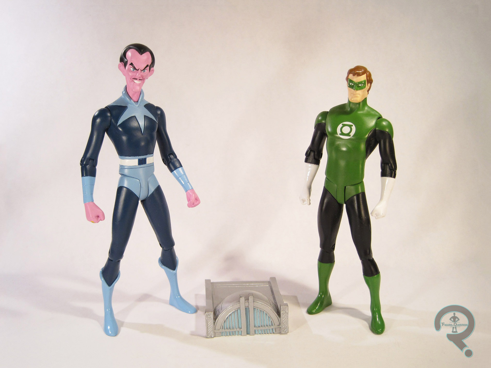
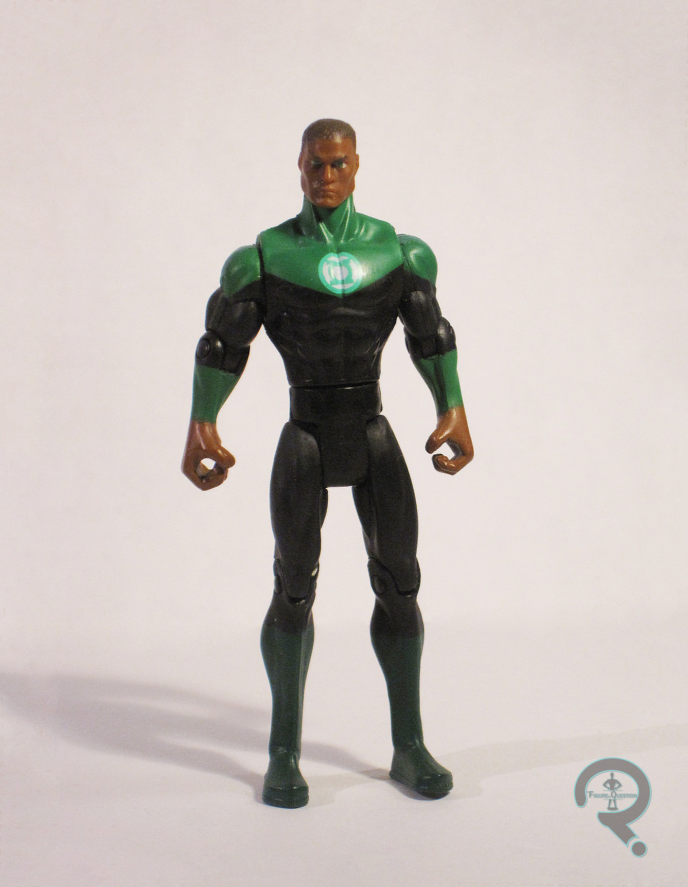
So, it’s John Stewart.  Earth’s 3rd or 4th Green Lantern, depending on how you look at it.  Not the host of The Daily Show.  Sorry if it’s confusing.  John was released as part of a Green Lantern themed 6 pack.  The set was released relatively early on in the life of the Infinite Heroes line.  The figure stands about 3 ¾ inches tall and has 10 points of articulation.  Like most of Mattel’s DC toy lines, DCIH operated on the buck system, meaning every figure was built on one of the few stock bodies.  Unfortunately, the stock bodies for DCIH aren’t anywhere near as nice as those used for DCUC or even Justice League Unlimited.  John was built on the slightly larger male body.  This is okay, since John tends to be depicted a little bigger than Guy and Hal, but the body itself is probably one of the worst of the stocks.  The waist is super tiny, the arms are bulky and stubby, and the hands are GARGANTUAN.  The only new piece here was the head, and it doesn’t do much to improve the figure.  I’m not really sure what look they were going for, but John looks sort of like he was kicked in the crotch while eating a whole pack of Sour Patch Kids.  I’d love to say the paint helps the figure, but it just makes things worse.  For some reason, they gave John brown hair and eyebrows, which makes his whole heal look a bit…mushy.  Plus, his eyebrows kinda give off a weird Vulcan vibe.  The paint is particularly sloppy on the wrists, and for some reason his boots are an entirely different shade of green than the rest of his uniform.  John includes no accessories, which is a shame because they might have added some value to this figure.

THE ME HALF OF THE EQUATION

I don’t remember where I got this figure exactly.  I know at one point I had the whole set, but I think I sold most of the others off.  I don’t know why I kept him.  I think I just wanted to have John represented in this scale.  Infinite Heroes wasn’t a very good line, but there were a few figures that didn’t totally suck.  John is not one of those figures.

#0128: Superman

SUPERMAN

JUSTICE LEAGUE (MATTEL)

A large portion of my appreciation for DC characters comes from the DC Animated Universe, created back in the early 90s by Bruce Timm and Paul Dini, when they first started Batman: The Animated series.  Batman led to Superman and Batman Beyond, and eventually, they moved on to what many see as the greatest entry on the list: Justice League and Justice League Unlimited.
Kenner offered the initial figures for BTAS, and when they were bought out by Hasbro, Hasbro continued.  By the time of JL, Hasbro was interested solely in Batman and Superman variants, so they had no plans to release the team from the show.  Eventually, the license was moved to Mattel, and Mattel quickly released a set of the seven main characters.  Today, I’ll be looking at the Superman from that line.

THE FIGURE ITSELF

Superman was modeled after his design on the show, specifically his look from the first season, although the differences are minor.  He stands just shy of 5 inches tall and features 5 points of articulation.  The sculpt is really sharp, and  very accurately represents the design on the show.  The design doesn’t really translate well to articulation, so Mattel seemed to go for the looks over movement, and I actually greatly prefer it this way.  I do wish that he had a little less of a hunched look on his neck, but overall, it doesn’t look too bad.  For the most part, Superman is molded in the appropriate colors where necessary, but what paint is there is fairly cleanly applied, and has no real issues.

THE ME HALF OF THE EQUATION

While I rushed to get the rest of the members of the team, I had plenty of Batmen and Supermen, so the two of them kinda had to wait.  Superman was actually not picked up individually, but actually was included with the Javelin 7, which I believe my brother and I bought a few years ago from a local toystore.  My brother kept the Javelin 7 to himself, and I got the Superman.  It’s probably one of the best animated Superman figures released, and fits nicely with the rest of the line.

#0108: Martin Jordan

MARTIN JORDAN

GREEN LANTERN (MOVIE)

If you’ve been following the site, you’ve probably picked up that I’m a pretty big fan of all things Green Lantern.  A little while back, I reviewed the basic Hal Jordan figure from 2011’s Green Lantern movie, where I noted that pretty much my only reasoning for purchasing the figure was because it was Green Lantern related.  Well, today I’ll be looking at yet another entry from that line, which I purchased for pretty much the same reason.  It’s the titular hero and his father Martin.

THE FIGURE ITSELF

The Green Lantern included in this set is identical to the one I reviewed previously, so I’ll just be looking at Martin this time around.  Martin was released as part of a two-pack exclusive to K-Mart at the time of the movie’s release.  The figure is based on Martins flight suit look from the movie.  He stands about 4 inches tall and has 6 points of articulation.  The sculpt is pretty much in line with the rest of the figures from the series.  The likeness on the head sculpt is actually pretty good.  The body isn’t terrible, although it is entirely inaccurate to the flight suit Martin wore in the movie, since they just reused the test-pilot Hal Jordan body.  The paint has no slop or anything, but it’s incredibly basic, and quite drab.  Which I guess is good because it fits right in with all of Mattel’s other offerings from the movie.  He included a Ferris Air parachute, which was just kind of a cheap piece of plastic that I didn’t feel the need to hang onto for any particular reason.

THE ME HALF OF THE EQUATION

Like the Hal Jordan figure, this figure is a decent offering…if it had been released about 10 years prior.  Mattel really phoned this line in, and it’s incredibly obvious.  Plus, we got Martin Jordan in the 4 inch line, but not Hector Hammond, Carol Ferris, or Amanda Waller?  Martin had less than 5 minutes of screen time, and it’s not like he had a particularly interesting look.  I wish I had more positive things to say, but I really can’t think of any.

#0106: Black Hand

BLACK HAND

GREEN LANTERN: REBIRTH (DC DIRECT)

I’ve mentioned before that I’m quite the Green Lantern fan.  Well, I’ll be frank, that doesn’t really extend to his villains.  Sure, I’m a fan of characters like Sinestro and the original Star Sapphire, and heck I’m even a pretty decent fan of characters like Sonar, Evil Star and Goldface.  But there are some Green Lantern villains I just plain don’t like.  Like, for instance, Hector Hammond, star villain of the 2011 Green Lantern movie.  My opinion of today’s character, Black Hand, is not as simple as the previously mentioned opinions.  No, he’s much more complex, and today’s figure just plays right into those mixed feelings.

THE FIGURE ITSELF

Black Hand was released as part of the first wave of DC Direct’s Green Lantern: Rebirth line, done to coincide with the comic event of the same name.  Hand himself only has a minor appearance in the actual Rebirth series, and he doesn’t look like this.  The figure here is actually based on Hand’s look in the re-launch GL book shortly after Rebirth.  While this is the look that would gain notoriety in Blackest Night and the like, it’s presence here seems to be solely because it was what Hand was wearing at the time, as the character would remain relatively obscure for a few more years.  Anyway, the figure stands a little over 6 inches tall, and features 11 points of articulation.  He looks to be built on a similar under-lying structure to that of the Hal Jordan figure released in this line.  The outer details are different, with Black Hand featuring a lot more details on his costume.  In particular, he’s got lots of wrinkles all over his costume.  What, does this guy not have an iron?  On his left arm, he’s got straps and buckles, I guess to “modernize” the character’s look.  The Right hand is the titular “black hand”, and is exposed in all its veiny goodness.  This guy also has a lot of rivets, which begs the question:  is his cosume actually riveted on to him?  That might explain the figure’s surly facial expression.  Black Hand is topped off by a non-removable rubber cape.  It’s a decent sculpt, but it can make the figure a bit top heavy.

THE ME HALF OF THE EQUATION

So, I’ve done my (mostly) non-biased review of the figure itself.  Now, onto the nitty-gritty, me part:  I absolutely, without a doubt in my mind, hate the modern Black Hand, and pretty much everything he’s been involved with.  I know, that’s a strong opinion, but I just haven’t liked what he’s been involved with.  Classic Black Hand had a pretty neat design, and while he was hokey as hell, that was a lot of fun.  A decent character.  But, hokey characters can’t be hokey anymore, so we wound up with this redo of the character, where he’s got leather straps, and wrinkles, a random lines all over the place, and looks like a zombie.  And, hey, “Black Hand” makes no sense, unless you spell it out for people by giving him a BLACK HAND!  Hey, MGM, I’ve got an idea for a Goldfinger remake.  Here’s the twist:  Goldfinger loses one of his fingers, and he has to replace it with one MADE OF GOLD!

I know what you’re thinking: If you hate the design so much, why do you have the figure?  Because I got him for a dollar.  And for a dollar I guess he’s alright.

#0098: Negative Man

NEGATIVE MAN

DC UNIVERSE CLASSICS

Ah, DC Universe Classics.  A line that left me with so much confusion.  The line led me to steadily hate everything Mattel did.  But on the same hand, it was the DC toy line I’d wanted since I was 4 or 5.  Not only did it have great versions of the big name characters and their supporting casts, but it also gave us characters we never thought we’d see released in a retail toy line in a million years.  I’ll be looking at Negative Man, one of those characters, today.

Negative Man, or more specifically Larry Trainor because Negative Man wasn’t actually his name, was a member of the wacky 60s super hero team the Doom Patrol.  The Doom Patrol weren’t your conventional super heroes, no, they were freaks and outcasts that the public had shunned.  They were led by a wheelchair bound man and they fought the Brotherhood of Evil.  No, I didn’t make that up.  They were totally the X-Men, only at DC.  Not a rip off, mind you.  They debuted the same year, and neither one was really a best seller.  But eventually X-Men became one of the bestselling comicbooks ever, and the Doom Patrol were mostly forgotten.  Sure they’ve had a few reboots, but none of them ever really captured the fun of the original series, and none of them ever really lasted all that long.

Anyway, Larry was a test pilot who was exposed to some strange energy that turned out to be the sentient being N-Man.  N-Man was trapped inside of Larry’s body, and could only be released in 60 second intervals, or Larry would die.  When N-Man was present in Larry’s body, Larry was radioactive, so he had to be wrapped in specially treated bandages to keep the radiation contained.  I’m gonna be honest, it was a pretty sweet concept!

THE FIGURE ITSELF

Larry was released as part of the 13th wave of DC Universe Classics.  Believe it or not, Larry’s actually had a few looks over the years.  Mattel has chosen to go with what is probably the character’s best known look, his red and purple number that he sported for the majority of the original series.  While I’m partial to his original green uniform, I think they picked the right costume.  He stands just shy of 6 ½ inches tall and he has 24 points of articulation.  DC Universe Classics operated on the buck system, meaning they had a set of differently sized bodies and the picked the one that best suited the character in order to save on tooling.  Larry is based on the medium build male buck, which works fine, since he’s not supposed to be a powerhouse.  I’ve heard arguments that he should have been on a skinnier body, but I think the medium build looks just fine.  In addition to the buck body, Larry has specially sculpted parts for his head, neck, hands, belt and boots.  The head, neck and hands are all bandaged, and they all look pretty cool.  They found a decent way of handling showing a face, without it looking too silly, which is a good thing.  The belt has a cool leather texture to it, which is one of those things that could have easily been left out, but I’m really glad wasn’t.  The boots are actually a reuse from the line’s Green Arrow figure, but if it’s a good part, use it.  The paint on Larry is all well applied, with no slop or bleed over.  There are several washes present to bring out the details in the sculpt.  In one area of disappointment, Larry includes no accessories apart from the requisite C-n-C piece.  It’s Trigon’s staff for those who care.  But, Larry himself gets nothing, not even a cool snap on Negative Man effect!  I guess they had to draw the line somewhere.

THE ME HALF OF THE EQUATION

In spite of DCUC’s spotty distribution, I actually found Larry in store with relative ease.  I was greatly excited by that, as he’s one of my favorite characters, and I’ve always wanted a figure of him.  This one did not disappoint.  Larry shows the DC Universe Classics line at its best.  Well distributed, well sculpted, cool obscure character.  He was just full of win!

#0095: Green Lantern & Sinestro

GREEN LANTERN & SINESTRO

SUPER FRIENDS (DC DIRECT)

Today, I’ll be looking at another piece of my extensive Green Lantern collection, though unlike the last time, this is a set I acquired because I actually wanted it, not just because it said “Green Lantern” on the box.  This time around, it’s a 2-pack from DC Direct’s Super Friends line released a while back.  In particular, it’s Green Lantern and his nemesis Sinestro based on their appearance from the 70s TV show Challenge of the Superfriends.

THE FIGURES THEMSELVES

This pair was released as part of the 3rd wave of 2-packs from DC Direct’s Super Friends line.

GREEN LANTERN

Up first, it’s the hero of the set, Green Lantern.  Unsurprisingly, he’s based on the character’s appearance from the show.  He stands a bit over 6 inches tall and has 9 points of articulation.  The articulation can be a bit tricky, as the ball joints on the arm have a tendency to pop out, leaving poor Hal armless.  The sculpt on the figure is very smooth, and all the lines are very clean, which is appropriate for the design they were trying to capture.  In particular, the head sculpt really got the character design from the show down.  The paint is also clean and basic, but that’s no surprise, given the look they wanted.  The pupils seen through the mask can be a bit unnerving, but that’s in line with his design.  The figure included a lifesize version of his ring from the show, a display stand with the Super Friends logo, and a miniature version of the hall of justice.

SINESTRO

Next, Green Lantern’s arch-nemesis, Sinestro!  Sinestro is, of course, based on his appearance in the show.  He stands just shy of 7 inches tall and has the same 9 points of articulation as his pack mate.  Unlike GL, Sinestro doesn’t seem to be plagued by the arm issue, which makes him a bit easier to pose and such.  Sinestro’s sculpt is a bit more detailed than GL’s, since his character design was a bit more intricate.  A lot of the musculature of the sculpt is very similar, just stretched out to convey Sinestro’s tall, lean build.  Like with GL, the head sculpt is really the shinig point of this figure, giving Sinestro the perfect sinister grin.  Sinestro also includes a lifesize model of his ring from the show and a display stand with the show’s logo.

THE ME HALF OF THE EQUATION

Green Lantern and Sinestro were a birthday gift from some family friends who were aware of my intense Green Lantern fandom.  I greatly appreciated it, and it was actually my only figure of Sinestro for a good long while.  I still really like this set, as it’s a great representation of a popular take on the characters.  I can’t look at them without the Challenge of the Super Friends theme starting up in my head.

#0091: Hal Jordan

HAL JORDAN

GREEN LANTERN (MOVIE)

Having rounded up all of my Christmas gift reviews (barring any late gifts, I suppose), I’ll be moving back to my regularly scheduled programming of random figures from my vast collection.  A large subset of my collection is solely Green Lantern items, due to me being a really big fan of the character.  Being such a fan, sometimes I buy stuff solely because it’s Green Lantern.  That was the case with today’s figure, which hails from Mattel’s toy line to tie in with 2011’s Green Lantern movie.  It’s the basic version of the main character, Hal Jordan.

THE FIGURE ITSELF

Hal was released in the first wave of figures from Mattel’s Green Lantern line, which came out a few short weeks before the movie’s release.    He stands about 4 inches tall and has 8 points of articulation.    He’s based on Hal’s fully GL’ed up look from the movie.  The sculpt is passable, though the details are a bit on the soft side. The likeness on the head is pretty good, with a decent representation of Ryan Reynolds from the movie.  The paint is fine, nothing spectacular, but there’s no slop of smudges which is nice, but details like Green Lantern’s power ring are left completely unpainted.  This gives the figure a cheap look, but it’s wasn’t a “cheap” figure to buy.  Hal includes a clear green construct.

THE ME HALF OF THE EQUATION

Yeah, so this figure is, well he’s not very good.  If he’d been released 10 years earlier, perhaps it’d be okay, but not for a modern day figure.  It’s cheaply made, the paint is as simplistic as possible, and he has practically no articulation, which means he’s not a very entertaining figure.  I have this figure because and only because it’s a Green Lantern action figure.

#0077: Batzarro

BATZARRO

DC UNIVERSE CLASSICS

Happy New Year everyone!

This isn’t the first time I’ve looked at DC Universe Classics, and I’ve gone into my frustrations with the line and those running it.  The final figure in the second and final year of the subscription’s run was just released this month, and he fits in perfectly with the overall mixed feelings of the line.  Anyway, I’ll save my thoughts for the last section. In the meantime, I’ll take a look at Batzarro.

Real quick sum up of the character for those who aren’t familiar:  In the 60s, the character Bizzarro was created as an Anti-Superman.  He spoke in backwards sentences, used reverse logic, and had the opposite powers of the Superman.  40 some years later, writer Jeff Loeb and artist Ed McGuinness created Batzarro, the Batman to Bizzarro’s Superman.  His name is Wayne Bruce, and he turned to a life of crime when his parents were born in crime alley.  Yes, that’s really his origin.

THE FIGURE ITSELF

Batzarro was the 12th figure in Mattel’s 2013 DC Universe Classics: Signature Series subscription.  He stands a little over 6 inches tall, and has 23 points of articulation.  Batzarro has had exactly one look… ever.  So, that’s the look depicted here, which is far from shocking.  Batzarro is made from a fair deal of reused pieces, with a new head, cape and belt.  The rest of the figure is built on a basic DCUC body, specifically the Batman body.  It’s a sensible reuse, given the nature of the character, so no issues there.  The new pieces are all very well done.  In particular, the head looks spot on to the character, with his eyeless cowl and evil grin.  The paint on the figure isn’t perfect, as I did notice a few fuzzy lines and some missed marks, particularly on his belt buckle, which is a noticeable distance from the edge.  But it’s also far from terrible, so, it doesn’t ruin the figure.  It’s just mildly annoying.  Batzarro includes a single accessory, his batarang.  Given his place as the anti-Batman, Batzarro was frequently depicted toting around dual pistols, and the lack of inclusion here is unfortunate, especially given the pricepoint of the figure.

THE ME HALF OF THE EQUATION

So, yeah… this figure.  Hands down, one of the most mixed-feelings-y figures of all time.  You see, I didn’t want to like this figure.  At only 12 figures a year, he’s an absolutely terrible choice.  The character had one storyline, a few years ago.  It wasn’t a monumental story, and he’s not even really a major player in it.  The character’s design is perfectly fine, but not revolutionary.  Of all the characters in the DC Universe, he’s far from the top of anyone’s list of “necessary characters.”  And his placement at the end of the year means two things. 1) He wasn’t amongst the characters subscribers were shown when they signed up, meaning we had to accept him whether we liked it or not, and 2) he was one of the figures that had a direct impact on if the next year of the line went through or not.  Unsurprisingly, next year’s subscription didn’t go through.

But quite frankly, the most damning thing about this figure is that he’s actually a pretty well done figure.  Not the best in the line, but actually good.  Better than a lot of the other figures offered this year.  So, this figure that nobody wanted ended up much better than several of the figures that people have been wanting for years.  It all just leaves a bad taste in the mouth and further punctuates the mismanagement of the line.  So, here I am with a figure I quite like of a character I’m just indifferent about.  I suppose that’s not all bad…

#0072: Ice

ICE

DC UNIVERSE CLASSICS (MATTEL)

So, here’s an interesting review.  Rather than looking at something that’s been out for a while, I’m taking a look at something that technically isn’t out yet.  I’m doing some crazy time travel voodoo!

So, I spoke briefly in my review of Ultra Humanite about the demise of the DC Universe Classics line.  This year saw the release of third-tier Justice Leaguer Fire, leading many fans to wonder when we’d see her longtime companion Ice.  Well, Mattel, in their infinite wisdom was attempting to get another year out of the line by making anyone who wanted to complete the duo buy into a whole year’s worth of monthly figures on blind faith.  As much as some people wanted the figure, Ice isn’t exactly going to make a huge number of sales for the line as a whole.  So it failed.

Or did it?

THE FIGURE ITSELF

Ice was released as…hmm…Ice was part of….um.   Ice is a figure that somehow fits into the DC Universe Classics line.  Exactly how is still a bit iffy.  Anyway, Ice is depicted in her Adam Hughes designed costume from when she was part of the Justice League International.  This is my favorite look of Ice’s, so I’m glad it was the one they chose for the figure.  Ice stands a little over 6 inches tall and has 19 points of articulation.  She’s built on the second female base body that Mattel introduced into the line, with new sculpts for the head, upper torso, and lower legs.  The head is okay.  Not the greatest, but far from the worst sculpt the line has produced.  The upper torso and lower legs depict the more 3d elements of Ice’s costume.  The fur of the boots looks pretty good, and the t-shirt thingy on the torso looks accurate and has some nice sculpted folds and such.  The paint is alright.  There’s some fuzziness on some of the lines of the costume, but nothing too terrible.  Ice’s only accessory is a clear ice blast piece, but my crazy time-travel-copy doesn’t have that piece. Oh well.

THE ME HALF OF THE EQUATION

Funny thing about the toy industry:  In order to have the first few figures for next year ready to go if the line did go through, the first three figures had to already be in production.  So Ice actually exists.  Rumor has it that she’ll see a release on Matty’s site sometime next year, but I imagine she’ll see quite a mark-up, and trying to order something from that site has to be one of the levels of Hell.  So, I got one…early.

Another funny thing about the toy industry: sometimes figures “fall off” the production line.  And occasionally, they wind up on certain auction sites.  And if there were, say, a significant delay between production and release, these “rejects” might show up several months before the real deal.  And perhaps, a few fans, eager to get the figures a bit early and with a little less hassle might just happen to acquire said figures.  Not that I’d know anything about that, of course.  It’s purely speculative.  I got my figure through crazy time travel voodoo!

#0071: Aquaman & Ocean Master

AQUAMAN & OCEAN MASTER

DC MINIMATES

Just when you thought there couldn’t be more, it’s another Minimates review.  Okay, I know.  It’s hardly a surprise at this point.  I’m a creature of habit.

Anyway, this’ll be my second look at the tragically too short DC Minimates line.  Unlike other Minimates, the DC ones were handled by DC Direct.  They were actually pretty innovative, and were released during a time when the Marvel line had somewhat stagnated.  When DC Direct upped the game, Marvel caught up and quickly surpassed them.  DC, for a variety of reasons decided to get out of the Minimate game just before Minimates hit it big.  Oh well.  So, today I’ll be looking at one of DC’s most infamous heroes: Aquaman and his *second* greatest foe Ocean Master.  So, there…

THE FIGURES THEMSELVES

These two were released as part of the 3rd series of DC Minimates.

AQUAMAN

First up, it’s the ever loveable Aquaman.  Yes, loveable.  Deal with it.  Aquaman is presented here in his classic orange and green look.  If you want to get technical, he’s got his look from the early issues of the Peter David series, since he doesn’t have the black shorts over his pants.  But most people probably wouldn’t notice the difference.  He’s on the usual Minimate body, which means he’s got 14 points of articulation and stands about 2 ½ inches tall.  He has specially sculpted hair, gloves and feet.  The hair has a “heroic hair” thing going for it.  The gloves were used a few times over the course of the line, and are just basic flared gloves.  The feet are specially sculpted to feature fins at the back.  The rest of Aquaman’s details are handled via paint.  He’s mostly molded in the appropriate colors, so the paint is only really used to provide detail lines.  Everything is pretty sharp.  The face has a nice stern regality, and the shirt has the appropriate scaled texture, which is nice and subtle.  Aquaman includes a trident, because that’s the accessory you give Aquaman.  I’m pretty sure that’s like in the DC license or something, because every damned Aquaman has one, and the character’s used one, like once.  But it’s there, so…

OCEAN MASTER

Next, it’s umm, well its Ocean Master.  “Who is Ocean Master?”  Yeah, legit question.  He’s Aquaman’s half-brother Orm, who wanted to be Master of the Ocean or something, so he fought Aquaman a lot.   He’s shown here with what I believe is his look from the 90s.  It’s not far off from his earlier look, but he’s gray instead of a mash of purples.  He’s on the usual body, and has the usual stuff.  He’s got a helmet, cape, belt and gauntlets.  All new pieces, and I don’t believe any of them were ever reused, which is bold, considering it’s Ocean Master.  The rest of the detail is handled with paint.  It’s all very sharply done, although the face is a bit odd.  Ocean Master includes his own trident, but it does make a little bit more sense here.

THE ME HALF OF THE EQUATION

Like with the rest of the DC Minimates line, I eagerly picked this set up the day it was released.  It’s a pretty good example of the line’s strengths, in how it handled the heavy hitters, and it’s well done sculpted parts, but it also shows the lines faults, like releasing Ocean Master over a better known Aquaman villain such as Black Manta, or even Aquaman’s sidekick Aqualad.  I still really like this set and still wish there were more DC Minimates!